boiled goose
good with gravy
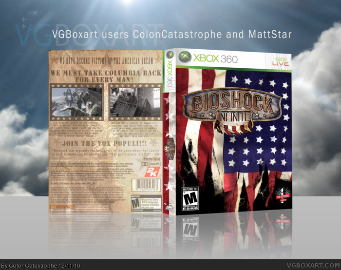
Maybe they are forced to change the cover because of controversial imagery.

Really? you don't get how this could be considered generic?
A male caucasian on the center holding a gun. It barely showcases the setting. You probably won't even see that dude 99.9999% of the time in the game.
This shit looks Irrational.
does anyone really uses PS Move to play games?
Sorry.You make a great point with dude on the cover with a gun/menacing dude on the cover, but comparing the art in any of those to this one and labeling it with that overused word is an insult to me. Maybe because the word gets thrown around too much on this forum that I just hate the sight of it now probably.
It's the main protagonist of the game, the guy you'll be using. In first-person, sure, but that's him. I wonder if part of the criticism comes from the fact that some people are still tying the name BioShock with Rapture the underwater city, instead of this totally new setting.
Sorry.
Edit:
I actually like the art style and colours, I liked it at first impression, but the actual pose etc just ruins it IMO, especially after remembering all those covers I showed you. It's the pose that's "generic".
Uh, I'm pretty sure it's more of the opposite. Columbia is a large part of what is so compelling about Bioshock Infinite; something -- anything -- to convey this would have made for a more attractive cover.
That's a bit different from the first impression I got from you, thinking that the whole package was generic, but at least you like the art & colors as well.
")
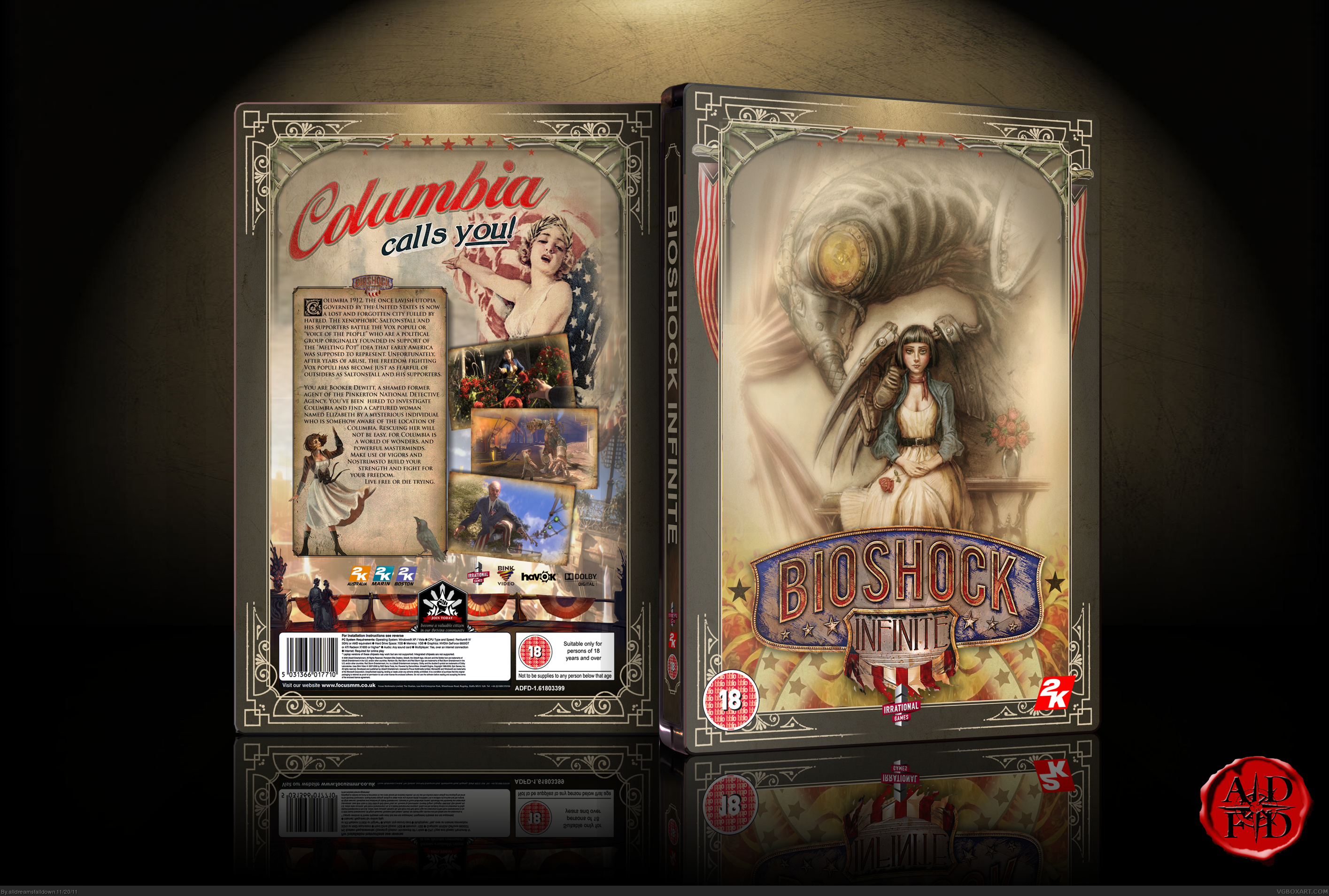
Cover redeemed! they hired that cosplayer! Elizabeth is featured on the back of the box, as well. damn that's cool.
http://irrationalgames.com/insider/we-love-our-bioshock-cosplayers-so-much-we-hired-one/
considering the artwork that has existed for this game up to now, that cover is incredibly unfortunate. why not something like this?:
edit: whoa. what timing, sillyeskimo.
Well, at least she isn't showing any cleavage on the boxart. That's a start...right?
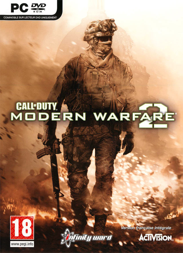
imo is that one actually a little different. Instead of holding his gun as if he's ready to fuck shit up, he's just carrying it. Makes the whole picture less aggressive.
does anyone really uses PS Move to play games?
Cover redeemed! they hired that cosplayer! Elizabeth is featured on the back of the box, as well. damn that's cool.
http://irrationalgames.com/insider/we-love-our-bioshock-cosplayers-so-much-we-hired-one/

imo is that one actually a little different. Instead of holding his gun as if he's ready to fuck shit up, he's just carrying it. Makes the whole picture less aggressive.
*clicks Anna Moleva's page*
LOL your right, he looks like he's thinking "F*ck this, I'm going home"
Kind of expressive of Infinity Ward's feelings during MW2's development.
Almost perfect, much more up my alley.
:lol
This^ or This
would have been great