The Wallpaper they released a while ago would have been better.
^It's still quite dudebro but a lot more stylized.
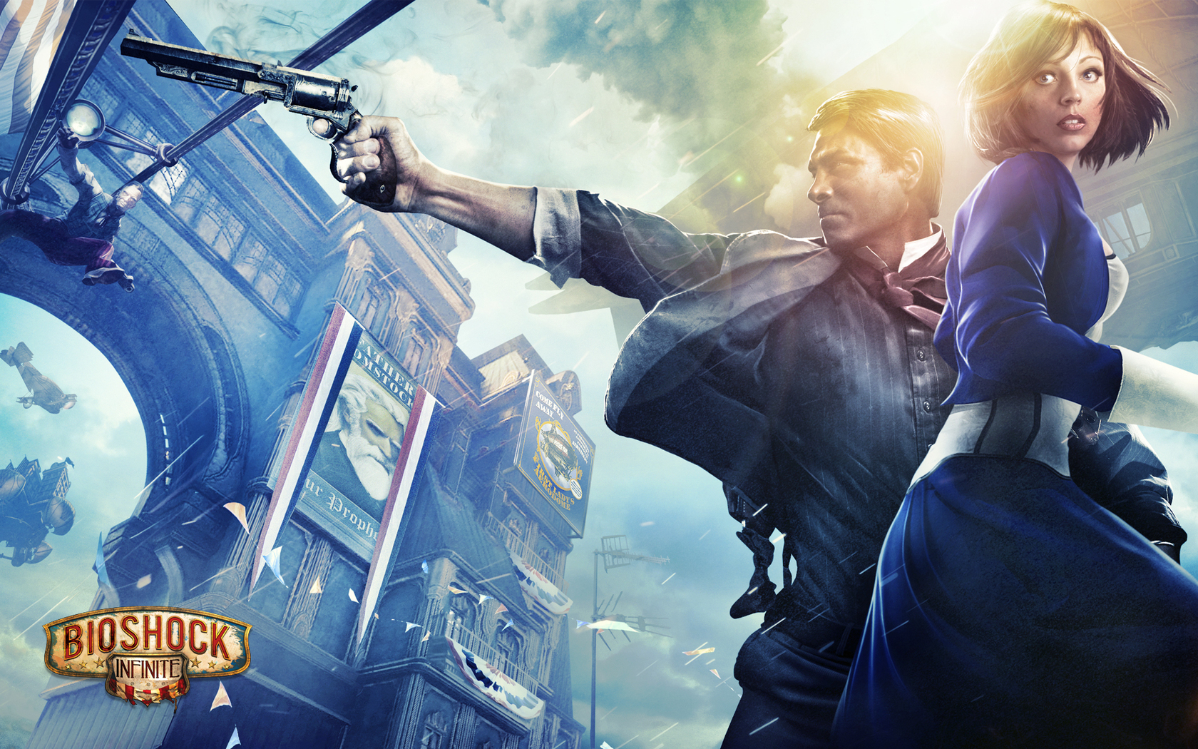
I wonder why they didn't use the Songbird or anything else that makes the game unique.
^It's still quite dudebro but a lot more stylized.
I wonder why they didn't use the Songbird or anything else that makes the game unique.