Okay, so, jstevenson, I have two honest questions.
1.) What do you feel Gearbox did with their art style that caused them not to elicit the response Overstrike got in focus groups while retaining their colorful, cartoony art style and actually managing to sell millions upon millions of copies on consoles?
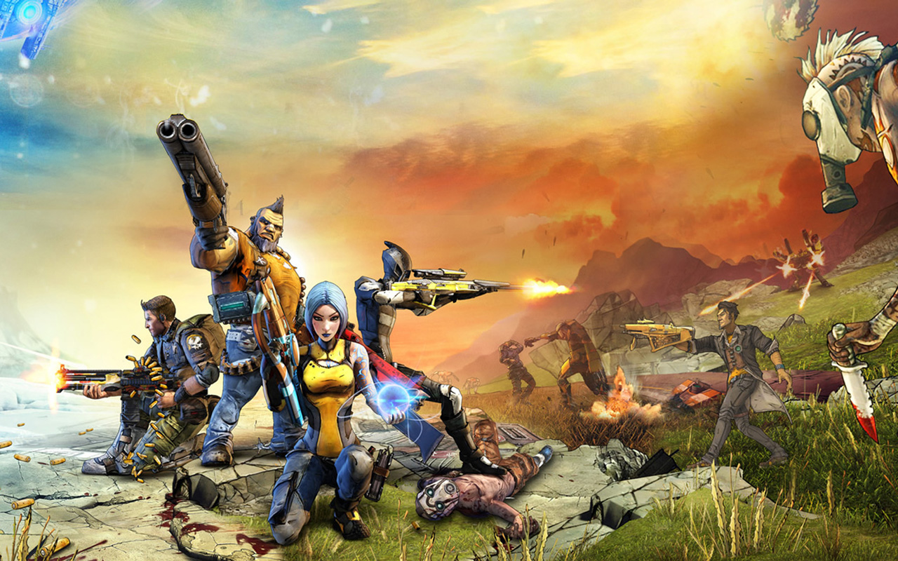
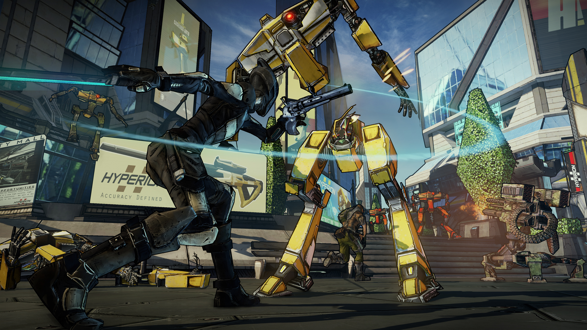
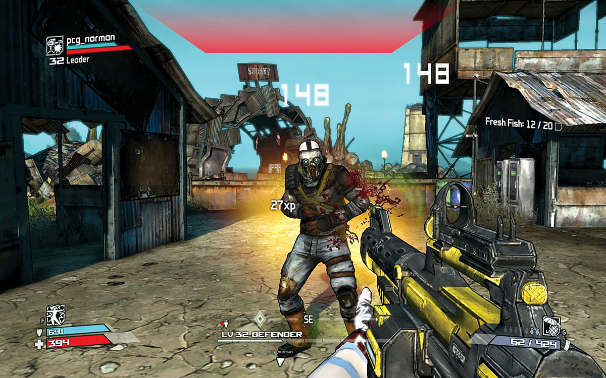
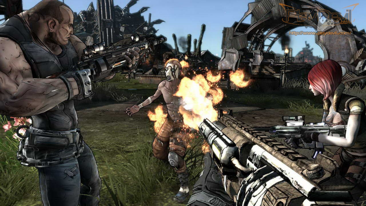
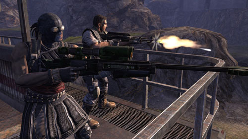
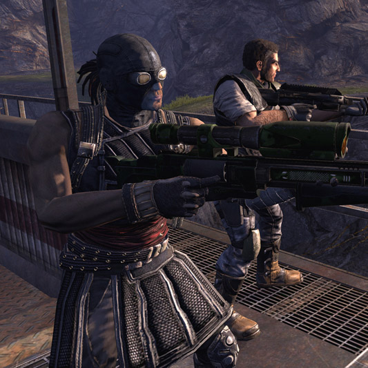
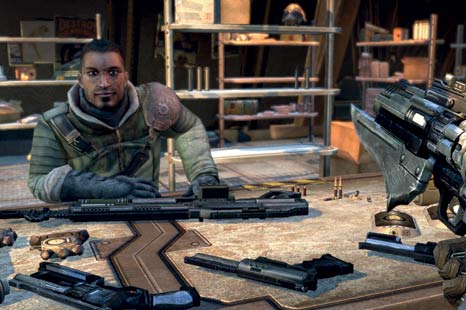
I've included a few sample pictures so we don't have to random google image search while having a discussion.
2.) Why do you feel it was a better idea for Overstrike/Fuse to switch to a much more photorealistic, grayscaled style than try to make something more cartoony and/or non-photorealisticly stylized for the final art direction, even if it was significantly different than the E3 trailer for Overstrike?
If the answer is "We honestly felt that from a creative perspective it was a vastly better idea to go the photorealistic route," I promise to stop criticizing your art style decisions in threads and will reply to your post saying that at least you're sticking to your new creative vision, which you felt was a better choice overwhelmingly due to creative decisions.
However, so far half the responses I've seen so far are related to this being a good business decision, and if the reason for the change at least contains a significant business component, I'm honestly curious why you feel this is the better business direction than taking the other direction of trying to make your product look more different (even if it looked nothing like Overstrike E3) given the amount of crowding in the market.