She got older yes.
Nevermind the completely different facial structure???
She got older yes.
This artwork sums it up nicely for me. Drawn like this, I don't think Tyrantrum stands out from any of the original 151 designs.
Art changes over time yes.Nevermind the completely different facial structure???
Oh come on now. There are a ton of crummy designs in the original 151. They're not all Mewtwo and Blastoise.
Oh come on now. There are a ton of crummy designs in the original 151. They're not all Mewtwo and Blastoise.
Epically blastiose.
For all the crap the later starters get, I don't feel like Blastoise gets enough. Not only does the design completely disregard what had been unique about that line up until that point (the tail) it grows freaking canons out of absolutely no where.
Huh? I was saying it doesn't stand out from the other designs, not that there weren't crummy designs in Gen 1. Backing up the wrong Street.
For all the crap the later starters get, I don't feel like Blastoise gets enough. Not only does the design completely disregard what had been unique about that line up until that point (the tail) it grows freaking canons out of absolutely no where.
Cannons are Rule of Cool and don't need any kind of logical explanation.
How 10 year olds are supposed to look like.
What is this chibi blasphemy?
Just look at what they did to misty going from FRLG to SSHG :C
from this
to derp
For all the crap the later starters get, I don't feel like Blastoise gets enough. Not only does the design completely disregard what had been unique about that line up until that point (the tail) it grows freaking canons out of absolutely no where.

Art changes over time yes.
Gold isn't fat short and ugly anymore I know.

It's three years later I think. She's older.
da fuck? are you serious?Gold isn't fat short and ugly anymore I know.
Good point. Love Ferrothorn, it's one of the most visually "what you see is what you get" Pokemon I've ever seen.It's really more so the poses being a bit more generic more than the change in coloring style in my opinion, most of the new Pokemon are given static poses to show them off better which looks a bit boring. Sugimori's obviously "evolved" as an artist though (for better or worse), I imagine it's probably hard for him to draw in the style he used to.
As a counterpoint to that, check Ferrothorn's Sugimori Art:
It actually looks really cool because it's in a more dynamic pose with interesting lighting.
Good point. Love Ferrothorn, it's one of the most visually "what you see is what you get" Pokemon I've ever seen.
^I mean, I guess it's true that Stadium and the console games have always shown them that way, but seeing it in the main games feels different. The evolution between even the GBA and now is awesome, at least to me.
For example;
VS. VS.
VS.

VS. VS.
VS.

I feel as though the in-game personality of the Pokemon makes up for any perceived generic-ness in the official art.

idk ever since gen 4, the faces on humans sometimes looks really weird
Here we go, here's what I'm talking about.
It's not nearly one of the uglier ones, but look how flat and textureless the eyes look.. What is that green part? Are the eyes just stickers? No depth.. no life.
As for the body, it's not as bad, but still.. is it an onion like some kind of root vegetable? Is it a rock? What's the theme here? What are the triangular parts pointing up to the eyes?
VS.VS.
I definitely like how Pokemon look now. The only problem I have is that the in-game models look really washed-out in terms of color, as shown below.
Whenever GF makes the next Pokemon game, they need to give the Pokemon back their color.
Ironically the models evoke the early watercolor based concept art better.

For all the crap the later starters get, I don't feel like Blastoise gets enough. Not only does the design completely disregard what had been unique about that line up until that point (the tail) it grows freaking canons out of absolutely no where.
Fat Pikachu looks absolutely terrible. I can't believe anyone would actually like this. He looks like he's incapable of movement.


The green parts are gaps in the armor that also act as "shadows under the eyes", making Ferrothorn look grumpy and tired. The "black triangles" resemble a fanged mouth, indicating the spiky obstacle is not particularly friendly. The body is shaped like any number of spiky plants such as the horse chestnut or the duran fruit with an emphasis on width and stability. The obvious theme of the immovable plant covered in steel armor and sharp thorns is "I am going to sit here doing what I like and if you tread on me so help me you will regret it."Here we go, here's what I'm talking about.
It's not nearly one of the uglier ones, but look how flat and textureless the eyes look.. What is that green part? Are the eyes just stickers? No depth.. no life.
As for the body, it's not as bad, but still.. is it an onion like some kind of root vegetable? Is it a rock? What's the theme here? What are the triangular parts pointing up to the eyes?
")
I actually really like the "Dream World" Global Link artwork they use for the online websites, everything's really bright and cartoony, and the Pokemon all look really vivid.
It's a bit more childish looking, sure, but I think it's cute.
The green parts are gaps in the armor that also act as "shadows under the eyes", making Ferrothorn look grumpy and tired. The "black triangles" resemble a fanged mouth, indicating the spiky obstacle is not particularly friendly. The body is shaped like any number of spiky plants such as the horse chestnut or the duran fruit with an emphasis on width and stability. The obvious theme of the immovable plant covered in steel armor and sharp thorns is "I am going to sit here doing what I like and if you tread on me so help me you will regret it."
The eyes themselves are heavy-lidded and bloodshot orange/yellow. They're not supposed to be cute, they're not supposed to be cool, they're not even supposed to look flat-out angry; they're supposed to look impassive at best and begrudging and sick of your shit at worst. No sparkles and rainbows, just a bunch of thorns if you want to seriously try it.
Now tell me your favorite Pokemon so I can eviscerate it.


I agreeFat Pikachu looks absolutely terrible. I can't believe anyone would actually like this. He looks like he's incapable of movement.
Hey guys, just a reminder.
This is what Pokemon actually looked like back then.


Still not FireRed.
Here's Firered Charizard.

Animals lose features all the time in evolution.The biggest problem with the Squirtle line is its the only Generation 1 Starter that doesn't have a clear and logical evolutionary path.
I mean, Wartortle gains the ears and tail, but then turns around and loses them in exchange for cannons. It's just really awkward and odd. It'd be interesting to see if there was ever a time when Blastoise's design kept those instead of losing them.
Look, I really like your description. What you're describing sounds really cool.
But the way it's drawn.. the style of the drawing. The actual critter looks bad. If the green is supposed to be the exposed interior, or a depression in the armor, it's simply not indicated by a solid line. Put some depth in the armor.
If the triangles are supposed to resemble teeth, I say, make them teeth.. Make them fangs that stick out slightly from the body, so it's not just a round spiky thing with it's eyes and mouths pasted on.
I don't want rainbows and cuteness. I just want some texture.. something the looks like it could in some way be a real thing.. That's my beef with most of the modern lineups. They're extremely flat and dull, and half of their features look like flat stickers on a form.
Looking back at generation one, more of them suffer slightly from my complaints about the modern bunch, but in a simpler way... Like the weird markings on lickitungs body...
But anyway, here are a couple pokemon I like:
It's attractive, it's simple, it has texture, and no weird circles and triangles or flat lines anywhere.. Great pokemon, the evolutions are pretty decent looking too.
Look at this guy!.. He's a crab. He has a hard looking exoskeleton! Simple, yet effective. He also has a look on his face that says 'I'm a little crazy'
The circular areas below him risk looking flat, but have form, as indicated by the broken line on the left one. It's the shape of his hard body. It's not just some lines and circles for no reason. Not brilliant, but a good creature design.
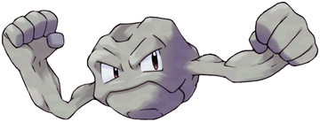
Yes, seriously. It's simple.. It's beautiful. It's a hunk of rock that's alive! It's also cute and has stony biceps! No lines, weird flat geometry, just a chiseled form with eyes that have soul. (His evolution makes no sense to his third form though.. No sense at all. Let's not talk about that.)
Honestly thought I would find more I liked here, but having trouble.


