• Hey, guest user. Hope you're enjoying NeoGAF! Have you considered registering for an account? Come join us and add your take to the daily discourse.

Anyone Miss the Old 1st Generation Pokemon Art Style?

Toxi

Banned
daBn7Bp.png

Look, I really like your description. What you're describing sounds really cool.

But the way it's drawn.. the style of the drawing. The actual critter looks bad. If the green is supposed to be the exposed interior, or a depression in the armor, it's simply not indicated by a solid line. Put some depth in the armor.

If the triangles are supposed to resemble teeth, I say, make them teeth.. Make them fangs that stick out slightly from the body, so it's not just a round spiky thing with it's eyes and mouths pasted on.

I don't want rainbows and cuteness. I just want some texture.. something the looks like it could in some way be a real thing.. That's my beef with most of the modern lineups. They're extremely flat and dull, and half of their features look like flat stickers on a form.

Looking back at generation one, more of them suffer slightly from my complaints about the modern bunch, but in a simpler way... Like the weird markings on lickitungs body...

But anyway, here are a couple pokemon I like:

250px-133Eevee.png


It's attractive, it's simple, it has texture, and no weird circles and triangles or flat lines anywhere.. Great pokemon, the evolutions are pretty decent looking too.


098Krabby.png


Look at this guy!.. He's a crab. He has a hard looking exoskeleton! Simple, yet effective. He also has a look on his face that says 'I'm a little crazy'

The circular areas below him risk looking flat, but have form, as indicated by the broken line on the left one. It's the shape of his hard body. It's not just some lines and circles for no reason. Not brilliant, but a good creature design.


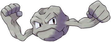
geodude.jpg


Yes, seriously. It's simple.. It's beautiful. It's a hunk of rock that's alive! It's also cute and has stony biceps! No lines, weird flat geometry, just a chiseled form with eyes that have soul. (His evolution makes no sense to his third form though.. No sense at all. Let's not talk about that.)


Honestly thought I would find more I liked here, but having trouble.
Krabby's boring, Eevee looks more like a stuffed toy than an animal, and Geodude isn't based on an animal.

250px-528Swoobat.png

"Too detailed."
378.png

"Too flat and undetailed."
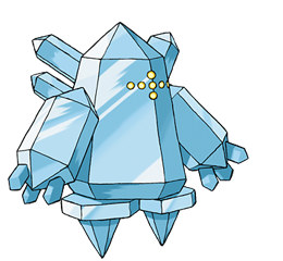
377Regirock.png

"Too rough and asymmetrical.
250px-507Herdier.png

"They just took my mom's dog and made it a Pokemon."
250px-596Galvantula.png

"Look at those flat, soulless eyes."
Pok%C3%A9mon_Blastoise_art.png

"What do those stupid-looking ears contribute to the design?"
250px-168Ariados.png

"Those markings have no depth and that horn is pointless."
250px-248Tyranitar.png

"Overdesigned piece of shit."
250px-712Bergmite.png

"Too simple."
250px-013Weedle.png

"I hate cute bugs."
 
250px-013Weedle.png

Gross. Looks like someone glued a bunch of potatoes together and then stuck a dunce cap on it just to highlight the stupidity of it all.
That's what Slowbro's for.

Although Squirtle is always the superior choice.


You could also use a ghost type as intended, if it weren't for the fact that only ghost type attacks were Lick and Night Shade and they didn't work anyway because of poor coding. Gen 1 is still best gen tho.
 
Krabby's boring, Eevee looks more like a stuffed toy than an animal, and Geodude isn't based on an animal.

"

I guess 'boring' is why people like the original so much, a good amount are just exaggerated versions of animals and mammals today.
 

Toxi

Banned
Gross. Looks like someone glued a bunch of potatoes together and then stuck a dunce cap on it just to highlight the stupidity.
You take that back.
I guess 'boring' is why people like the original so much, a good amount are just exaggerated versions of animals and mammals today.
I was joking when I called Krabby "boring". The entire post I made was a joke on the bizarre and hypocritical nitpicking people do to hate on new or old Pokemon, which include everything from "Not an animal" to "It looks too normal, like it could just be my mom's dog." I have seen every one of those arguments and by this point it's just kinda funny and sad.

Speaking of my mom's dog, we still get the exaggerated animals every time we get new Pokemon.
457Lumineon.png

The amount of random horns on Gen 1 Pokemon depressed me when I first noticed.
I don't see how it's depressing. Gen 1 Pokemon just shared a lot of design cues (Compare Kangaskhan, Rhydon, Nidoking, and Nidoqueen).
 
Where are y'all getting those lovely animated model GIFs with transparency from?

Whoops, meant to respond to this earlier.

Link: http://www.pkparaiso.com/xy/sprites_pokemon.php?cid=0#chunk0

Above is for gifs facing the front. They have at least one of every Pokemon (and form(e), I think), but they don't have battle animations for every Pokemon (yet).
Only thing they don't have are the 3 event legends from Gen 6, but they do have Mega Lati@s.

Here is the page for the back-facing gifs, too: http://www.pkparaiso.com/xy/sprites_pokemon_espalda.php

Check out that hair!

ampharos-mega.gif
 
Top Bottom