-
Hey, guest user. Hope you're enjoying NeoGAF! Have you considered registering for an account? Come join us and add your take to the daily discourse.
You are using an out of date browser. It may not display this or other websites correctly.
You should upgrade or use an alternative browser.
You should upgrade or use an alternative browser.
Awesome games with bad boxart.
- Thread starter the black pearl
- Start date
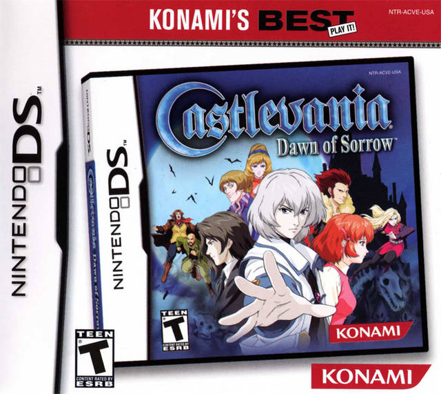
I want to say the reason this game did not sell as well is because of the stupid cover of all the early prints.

I can tell you, the cover was for sure not the only reason.
Doctoglethorpe
Member
Most awesome games.
Most box art in general is very generic and uninteresting to me.
Most box art in general is very generic and uninteresting to me.


The person who drew that cover is my neighbor two houses down. He gave me a copy of the game signed years ago.
Have you asked him if he ever played, or even just saw a screenshot of the game before drawing the cover?
Yep. Japan got this:

...while everywhere else gets this:

Disgusting. It's like they WANT the series to fail everywhere else.
")
As a PC gamer who hasn't bought a boxed game in years, I once saw this on a friend's shelf and was appalled.
Would be even bad for a infosheet.
RadioHeadAche
Member
I actually really like Snake Eater's boxart. In fact, I have a poster of it. Probably the only non-Shinkawa one I like. Except for MGS, but that was going for a minimalist style, which is cool.
Santerestil
Banned
Hello, young Dan Aykroyd on the middle left and Kyle MacLachlan on the upper right!
Awful and inconsistent with the game's aesthetic.
And they didn't even bother to use her real face: did they haven't the money for the rights or else?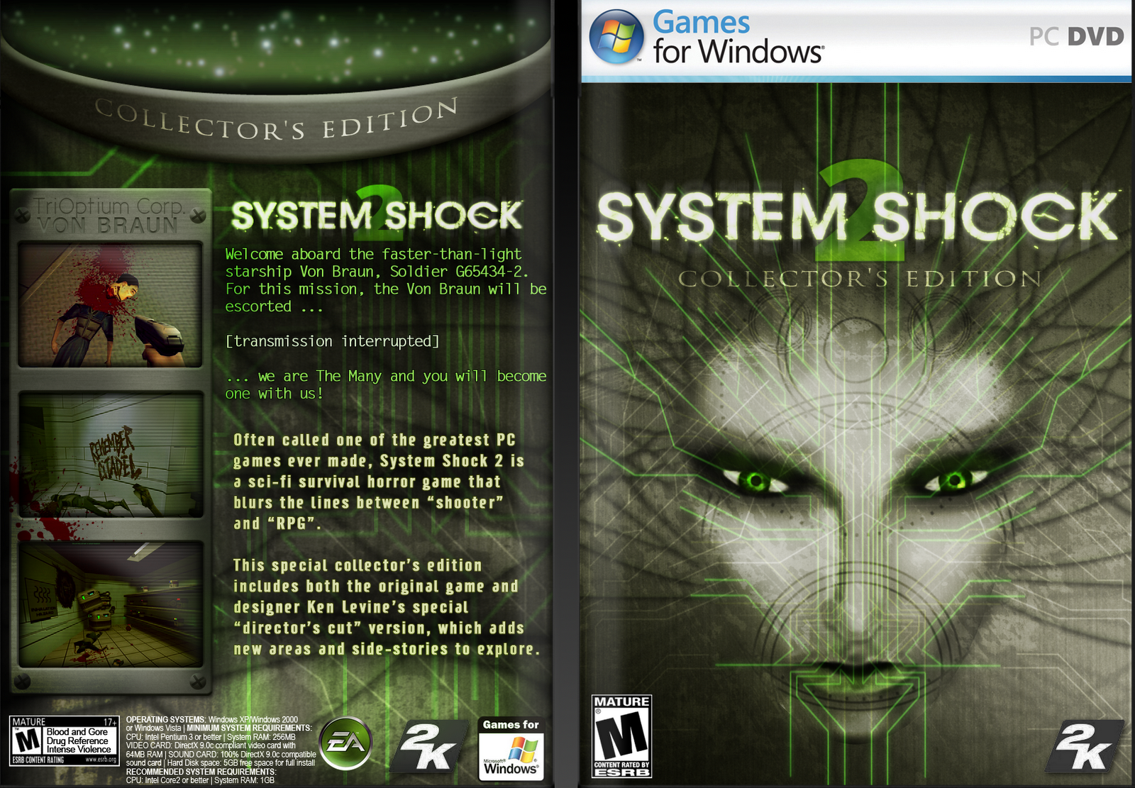
It's pretty bad from an aesthetic point of view, but what really sets it apart is that SHODAN's appearance is supposed to be a late-game plot twist.
TheMoon
Member
Yep. Japan got this:
...while everywhere else gets this:
Disgusting. It's like they WANT the series to fail everywhere else.
You seriously need to update your world map. North America does not make up "everywhere else."

Get real.
Cizeta-Moroder
Banned
I don't know, I think Alien Isolation would be perfect if it wasn't for the pretentious reflection.
Laieon
Member
Yep. Japan got this:
...while everywhere else gets this:
Disgusting. It's like they WANT the series to fail everywhere else.
I don't play the series, but I actually like the bottom box art more. The top looks really busy, it's kind of hard to tell what's going on. The bottom also gives me a better idea of what I could expect if I did play the game since it shows a bigger variety in weapons/character classes.
Werewolf Jones
Member

Why is the American boxart so shit?
BumblebeeCody
Member
Bloody hell


Every game from that system had terrible cover art.
Uhh yeah have a close up of Kazuyas face looking over his shoulder against a while background and slap the logo somewhere?
Cool done?
Ship it.
PdotMichael
Banned
never forget

I love how they westernized the two characters.
Theognosis
Member
Disappointed in you Gaf.

This one's a total disaster. It's too bad to be true.
Spieler Eins
Member
Didn't know they updated it in EU, thank fuck.
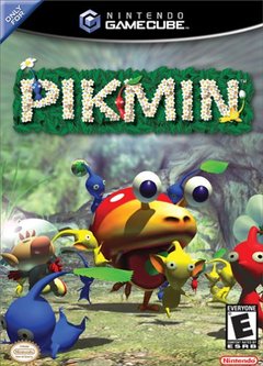
I always thought the PIkmin 1 artwork was a bit muddled. The focus of the shot is on one of the games enemies looking kind of derpy, and it's just overall kind of difficult to understand what is going on.
Pikmin 3's cover does a much better job of framing who the titular Pikmin actually are:

Deified Data
Banned

What? I have zero interest in Uncharted and this boxart actually makes me want to play.
Thread is off to a bad start it seems.
Anyway, here's a shitty trend in a lot of great game's boxarts: Dude standing walking towards you (or away) to look like a badass.
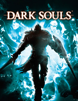
This . I dont even know if he's facing front or back and those blue thingy don't make sense on what they are .
I actually like this, it has charm.

There's nothing wrong with the art itself, but I never liked how Americans portrayed Sonic with a weird mohawk, and they always made Eggman look really mean and scary with soulless black eyes when in the games he's a goofy walrus looking guy who's called Eggman. I always preferred the covers Japan and the UK got.
Also, Gimmick

What even is that face
It also shouldn't show any monsters
Came to post this. God it looks horribly bland.


Uhh yeah have a close up of Kazuyas face looking over his shoulder against a while background and slap the logo somewhere?
Cool done?
Ship it.
Dude that's one of the best boxarts ever.
VisceralBowl
Member
This . I dont even know if he's facing front or back and those blue thingy don't make sense on what they are .
It's clear the character is walking away, into the blue "thingy' (which is a fog gate). The people in the fog probably are meant to represent other players/stuff (aka potential) behind the gate. It could be argued that it isn't a fog gate, but a flame that has been enkindled, and the characters are past adventurers (like the ghosts in the game) looking down on the character.
There's nothing wrong with the art itself, but I never liked how Americans portrayed Sonic with a weird mohawk, and they always made Eggman look really mean and scary with soulless black eyes when in the games he's a goofy walrus looking guy who's called Eggman. I always preferred the covers Japan and the UK got.

Nah this time the Japanese cover was way worse.
Just about to say that:
Awful and inconsistent with the game's atheistic.

Much better
We're done here.
NinJaSQUARE
Member

MikeBreezy92
Member
I don't think its fair to call covers bad in comparison. the covers should be able to stand on their own regardless if they are other versions then say if they are or good or not.
Slayer-33
Liverpool-2
The person who drew that cover is my neighbor two houses down. He gave me a copy of the game signed years ago.
Umm if you are serious, EBAY THAT SHIT FOR MILLIONS.
Finale Fireworker
Member
This is probably some of the best game artwork I've ever seen. It's like John Alvin or Drew Struzan's 80s movie posters, which defined the adventure genre.
I would kill for more game artwork like this.
This is why I hate these threads. People reveal themselves as having really poor taste.
That's... great. It's characterful and charming and exudes Drake's arrogance. I really like it.
Agreed. I realize Drake's expression is a bit comical, but I've always felt that it was intended to kind of emulate Harrison Ford's expression in some of the Indiana Jones movies (which is clearly the homage being made with the cover overall).
Jorok Goldblade
Member
SDCowboy
Member
Seriously, what's the story behind this box art. It's horrendous. lolThis one's a total disaster. It's too bad to be true.
Bedameister
Member

That Orange just looks awfull
That's beautiful boxart! Beautiful I say!

Nah this time the Japanese cover was way worse.
I won't disagree, but Sonic looks so much better there. It's really the character designs I take issue with.
Count of Monte Sawed-Off
un33dab@dpu$$y
Just about to say that:
Awful and inconsistent with the game's atheistic.
Much better
Yeah Suikoden is the first that pops to mind.
FirstClaes
Member
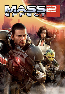
How has a that called awesome game with bad box art gone this long without Mass Effect 2?
It's actually posted quite early on the first page..
That's not part of the Metroid Prime series
Ah, I don't know why but my eyes filtered out the Prime and I just read it as Metroid.