-
Hey, guest user. Hope you're enjoying NeoGAF! Have you considered registering for an account? Come join us and add your take to the daily discourse.
You are using an out of date browser. It may not display this or other websites correctly.
You should upgrade or use an alternative browser.
You should upgrade or use an alternative browser.
Awesome games with bad boxart.
- Thread starter the black pearl
- Start date
Serves me right for only going through pages 2,3 and 4...It's actually posted quite early on the first page..
Finale Fireworker
Member
never forget

What is the hand painted like a puffin supposed to signify? I'm missing the joke.
TheMoon
Member
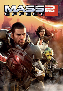
How has a that called awesome game with bad box art gone this long without Mass Effect 2?
How has someone complaining about something crucial missing from the thread not actually read the thread they're complaining about?
A game I'm playing now comes to mind.

For the longest time, I had no idea that Samus was on this cover firing her weapon. I thought the glowing circle was the morph ball or something.
This is the actual box art:

The Wii banner is just a plastic/cardboard sleeve (depends on the region)
the black pearl
Member
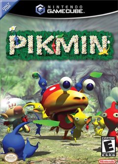
I always thought the PIkmin 1 artwork was a bit muddled. The focus of the shot is on one of the games enemies looking kind of derpy, and it's just overall kind of difficult to understand what is going on.
Pikmin 3's cover does a much better job of framing who the titular Pikmin actually are:

Pikmin 3's cover is fucking awesome, yeah.

EU and JP are so much better.
What an abortion of a cover lol.
petran79
Banned
LBA1 had a much better cover

Also I found this cover atrocious back then. Hardly capturing the game's atmosphere

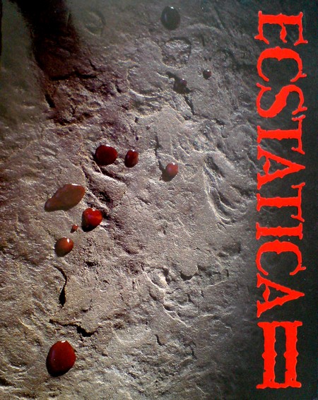
Also I was surprised that Ecstatica 2 had that bad cover

I bought this version instead
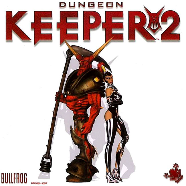
Also this cover. Game was inferior to DK1, still it was decent. But DK1 had much better cover
Also I found this cover atrocious back then. Hardly capturing the game's atmosphere
Also I was surprised that Ecstatica 2 had that bad cover
I bought this version instead
Also this cover. Game was inferior to DK1, still it was decent. But DK1 had much better cover
Dice//
Banned
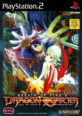
THE PS2 era was especially bad for using "PS2 era graphics" (which were kinda...yucky) as game covers. Worse was using iffy graphics instead of the beautiful artwork of the era.
The Breath of Fire V one shines here. They're not even in the same visual perspective.

Meanwhile, the JP cover shows EVERY RELEVANT CHARACTER in a dynamic assembly.
The Tales series has FINALLY learned to use the key art MADE for promotional purposes, but the older titles used terrible Photoshopping to arrange character in whatever-the-fuck manner, slapping status art, Mystic Arte cut-ins (fighting artwork for certain attacks, in other words), a really shitty shot of the main hero, and the "cute mascot"'s official hand-drawn artwork (while the rest is digital art). It's a mess. Then the cherry on the cake is the Photoshop filter background.
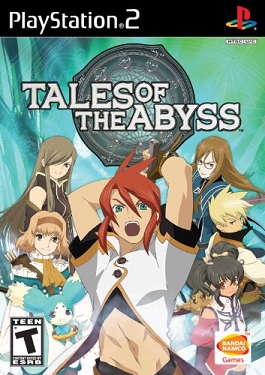
Tales of Vesperia takes the cake. Not only does it put a supporting cast member in the very front, but adds some awful car flame-job weaving through it for NO good reason. Hideous. I have no idea what they were thinking with this.

The Breath of Fire V one shines here. They're not even in the same visual perspective.
Meanwhile, the JP cover shows EVERY RELEVANT CHARACTER in a dynamic assembly.
The Tales series has FINALLY learned to use the key art MADE for promotional purposes, but the older titles used terrible Photoshopping to arrange character in whatever-the-fuck manner, slapping status art, Mystic Arte cut-ins (fighting artwork for certain attacks, in other words), a really shitty shot of the main hero, and the "cute mascot"'s official hand-drawn artwork (while the rest is digital art). It's a mess. Then the cherry on the cake is the Photoshop filter background.
Tales of Vesperia takes the cake. Not only does it put a supporting cast member in the very front, but adds some awful car flame-job weaving through it for NO good reason. Hideous. I have no idea what they were thinking with this.
A game I'm playing now comes to mind.
For the longest time, I had no idea that Samus was on this cover firing her weapon. I thought the glowing circle was the morph ball or something.
Holy shit. I thought it was like, a view from inside her gun or something.

Jesus Christ, it looks like a hentai parody. Dat creepy smirk.
MagnaderAlpha
Member
Because it subscribes to the same logic a lot of movie folk do by seemingly believing that you can make a suitable poster/cover art out of a photoshopped collage of separate characters over a screenshot of an event from the movie(or in this case, a still from the arrive of Lindblum).
Why is the American boxart so shit?
THE PS2 era was especially bad for using "PS2 era graphics" (which were kinda...yucky) as game covers. Worse was using iffy graphics instead of the beautiful artwork of the era.
The Breath of Fire V one shines here. They're not even in the same visual perspective.
Meanwhile, the JP cover shows EVERY RELEVANT CHARACTER in a dynamic assembly.
The Tales series has FINALLY learned to use the key art MADE for promotional purposes, but the older titles used terrible Photoshopping to arrange character in whatever-the-fuck manner, slapping status art, Mystic Arte cut-ins (fighting artwork for certain attacks, in other words), a really shitty shot of the main hero, and the "cute mascot"'s official hand-drawn artwork (while the rest is digital art). It's a mess. Then the cherry on the cake is the Photoshop filter background.
Tales of Vesperia takes the cake. Not only does it put a supporting cast member in the very front, but adds some awful car flame-job weaving through it for NO good reason. Hideous. I have no idea what they were thinking with this.
I love all of these, that vesperia box art is beautiful

nkarafo
Member
I still can't believe this got released. It looks like what a 8 year old would draw at school with some markers.Disappointed in you Gaf.

Haiiro Husky
Member
My picks are pretty much covered. Ico, MGS4, Yakuza 3, Dark Souls 1/2. I actually dislike any cover with CG-type assets used. I prefer the covers with art instead, and that they be a minimal. Less flashy, to me, is more attention grabbing than something like MGS4's Snake face.
Some of the choices in here are bad. MGS 2 and 3? No.
Especially considering VII's and VIII's(more VII) were well done.
Why is the American boxart so shit?
Especially considering VII's and VIII's(more VII) were well done.
ryutaro's mama
Member

C'Mon guys...this is 1 page tier.
Hands down my choice.
Dice//
Banned
I love all of these, that vesperia box art is beautiful
Sorry, I just don't see it at all. I'm an artist and graphic designer, these just feel like 'art throw up' easily patched together without much creative intent.
KevMan1815
Member

A game I'm playing now comes to mind.
For the longest time, I had no idea that Samus was on this cover firing her weapon. I thought the glowing circle was the morph ball or something.
Ohhh shit. I didnt know what the cover was until today

what? this is amazing.
Disappointed in you Gaf.
The person who drew that cover is my neighbor two houses down. He gave me a copy of the game signed years ago.
You should get that person to do more Mega Man box art. That's lifetime GAF Gold privileges right there.
nkarafo
Member
So, how old is that guy today? I would guess 30?The person who drew that cover is my neighbor two houses down. He gave me a copy of the game signed years ago.
loaf of bread
Member
Come on. This is top ten video game box art material. This is awesome.

Walter Matthau
Member
I never played this particular version of Puzzle Bobble so I don't know if it should be classified as "awesome", but that boxart is easily among the most atrocious I've ever seen. I'm actually disgusted looking at it.
We know where the kid from the Nirvana cover is now. Where is the Super Bust-a-Move baby now? Probably face down in a gutter waiting for another hit from drug of choice. Sure he/she is probably only 15-16 but still.
There's nothing wrong with the art itself, but I never liked how Americans portrayed Sonic with a weird mohawk, and they always made Eggman look really mean and scary with soulless black eyes when in the games he's a goofy walrus looking guy who's called Eggman.
Robotnik.
His name is Dr. Robotnik.
Robotnik.
His name is Dr. Robotnik.
Robotnik ain't the name on the side of his ship in Sonic 2
I still wonder how many people at Konami saw this and said, "yeah this box art is a great idea"There's worse.
Bl@de
Member


It's not even the official box. You posted some custom cover in cheap quality

Totally made up for it with the reverse cover though
Also wouldn't call Infinite awesome, but that is just my opinion
Yeah, this was my idea here too. The reverse cover kicks its ass.
How has a that called awesome game with bad box art gone this long without Mass Effect 2?
Not even that bad.

Morning Star
Member
I like how all of these artwork threads have the same games in them.
The person who drew that cover is my neighbor two houses down. He gave me a copy of the game signed years ago.
Does he think this was good?
aiat_gamer
Banned
Finally someone who appreciates this game, that game going so unseen is a travesty...
Such a shame, I thought the game was pretty great. The logo and cover art just make it seem like a really cheap and bland shovelware game.
I actually like this cover. Sure the art variant is better but I like how the cover represents Snake's state of growing tired and old.
EU and JP are so much better.
WhiskeyKnight
Member
Disappointed in you Gaf.
Uhh...the thread title said BAD box art dude.
That cover is amazing.
Kaneda Shotaro
Member
Have you asked him if he ever played, or even just saw a screenshot of the game before drawing the cover?
He said he loved the game and only saw some pictures of it. It was a small commission (this is the most I remember from talking to him when I was a kid. He still lives in the same place. His kids are all huge geeks now too.
Umm if you are serious, EBAY THAT SHIT FOR MILLIONS.
I lost it so many years ago when I was young lol. I also lost the Weezer vinyl of their first album (Blue) that was signed by every member at their first concert ever. Yes, I don't know what was wrong with me as a kid/teen. I'm pretty sure I threw it out when I was organizing my room one day and trying to focus on school.
So, how old is that guy today? I would guess 30?
He's probably in his 50s haha.
Captain Star
Member

The first Guitar Hero had some crap box art.
Raptomex
Member
Yeah, I've always thought this looked horrible. It looks like someone is still learning how to use Photoshop. I just don't get the "4".

Violence Jack
Member

I remember thinking this was a Flash Gordon game.
PayOffWizard
Member
I'm not sure why some people like it but i thought the alternative cover was just as bad as the original....Well maybe not as bad but its still pretty awful.

qualitydisc
Member
I'm playing through Nier right now and it's pretty awesome, the box-art on the other hand is pretty bad.
Nier's cover is fine IMO. Father Nier is a hideous dude, but there's no fixing that aside from a paper bag over the face.
I think it makes him more relatable/humanized as a character. I play plenty of JRPGs and I've had my fill of bishonen protagonists.
The game itself is Best of the Generation for me.

I'm not sure Karnaaj Rally qualifies as an "awesome game." Ugly as shit cover tho.
So, how old is that guy today? I would guess 30?
Thanks, I just spit out my coffee.