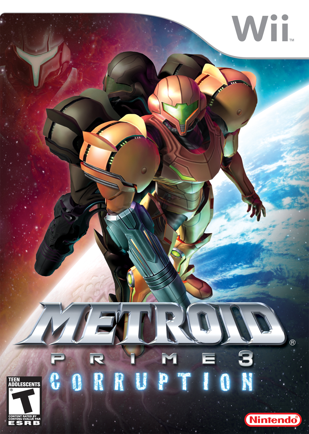
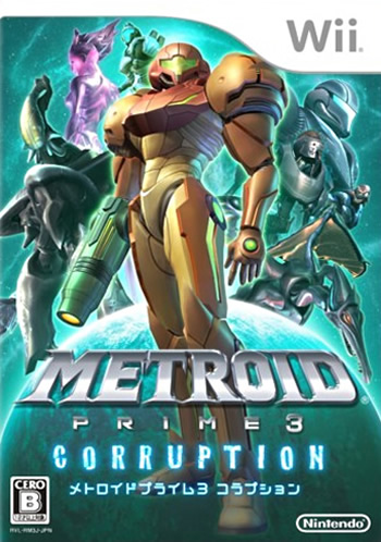
Metroid Prime 3's box art is especially atrocious. Why must there be a floating head?
Never noticed it until now, wow
Metroid Prime 3's box art is especially atrocious. Why must there be a floating head?
Somehow the Japanese version is even worse.
Metroid Prime 3's box art is especially atrocious. Why must there be a floating head?
Uh why?
Most THPS games have a cover shot of Tony Hawk doing a vert trick and they look great.
But instead, we're getting this:
I actually like the second one better. Its got a strange "pop" to it.
We could have had this:
But instead, we're getting this:

What the fuck is that cover
The Evil Within is alright.
Let's see if I can't redeem myself a little to this thread.
I want to like it.
This is the first time I've seen this and I honestly love it.


Not necessarily bad, but not worthy of the great title. 1 and 3's were much better IMO.
Awesome games with awesome boxart thread is over there -->
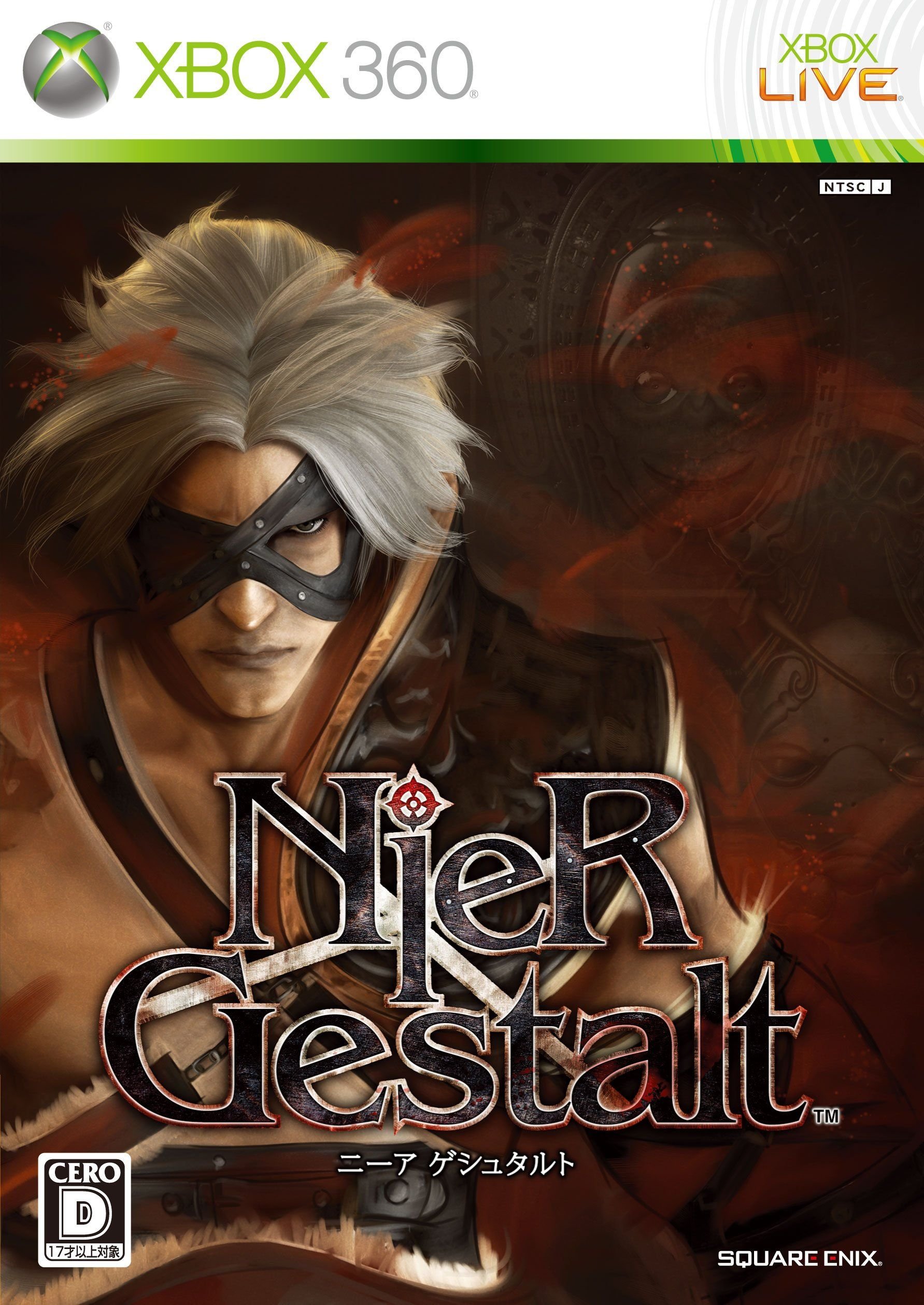
I'm playing through Nier right now and it's pretty awesome, the box-art on the other hand is pretty bad.

What? Nier's box art is awesome! a shame that the ingame character model doesn't come close to it.
2/3 fail right there in the OP (Alien and SotC).
I always thought Rage had a particularly weak box art which explains nothing about the kind of game it is.


I looked at this box on the shelf at Blockbuster for years and I didn't know what to make of it. Not sure what made me take a chance on it one day.
Maybe you should read next time. It's for awesome games, not terrible ones.
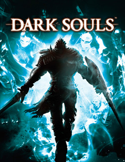
Yeah, Dark souls is so bad it kept me from playing the game for years. It's like the most generic thing ever.Thread is off to a bad start it seems.
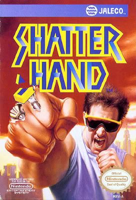
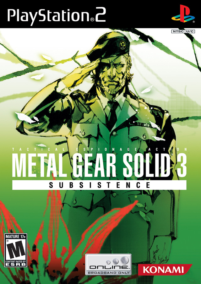
Anyway, here's a shitty trend in a lot of great game's boxarts: Dude standing walking towards you (or away) to look like a badass.

Metroid Prime 3's box art is especially atrocious. Why must there be a floating head?
Disappointed in you Gaf.


2/3 fail right there in the OP (Alien and SotC).
I always thought Rage had a particularly weak box art which explains nothing about the kind of game it is.
Man, the Metroid Prime series has a rough history with box-art. Outside Prime trilogy and the Japanese box art for Prime 2, all of them are bad.

Metroid Prime 3's box art is especially atrocious. Why must there be a floating head?
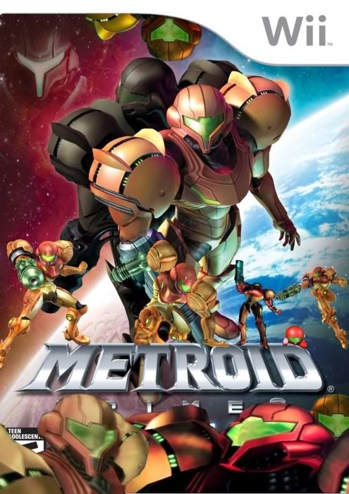
I have to agree. They started using shitty ass copypasted renders of monsters and the hunters instead of the great art of the older games.
From this:
to this:

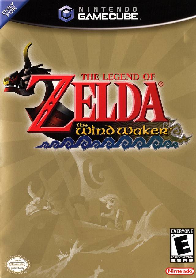
That's not part of the Metroid Prime seriesI think Return of Samus had pretty good art.

The original Suikoden is one of the best examples of this.


Never liked this.
That's better.

guess im alone in liking this