• Hey, guest user. Hope you're enjoying NeoGAF! Have you considered registering for an account? Come join us and add your take to the daily discourse.

Sonic's Logo

Stopdoor

Member
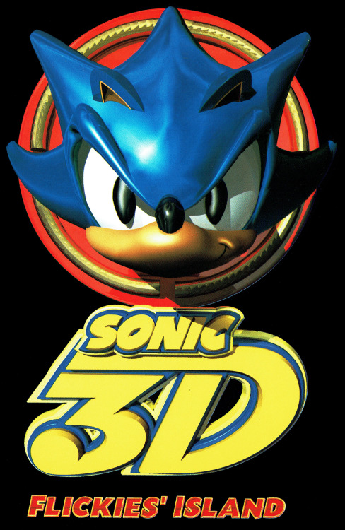
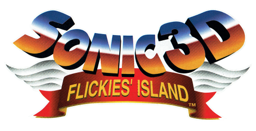
The other week there was a topic about Mario Kart's 'boring' logo, but with all the Sonic excitement going on, and people continually asking 'is/was Sonic good?', I think one thing we can give Sega kudos on: Sonic's logo is timeless.

VqIO2Hj.jpg


FULUa6Z.jpg


dDlPPD2.jpg


9MpD742.png


JJxIpvi.jpg


XFo3jKC.jpg


buuFHkq.png


90HNKxm.png


Some may get garish in colours, but they fit whatever game, and consistently, for nearly (the counterexamples are rare) every piece of official Sonic games and media, even cheap-o mobile games, reboots, and tv shows, they've kept the exact same font, with the lop-sided 'O' and 'C'. It's a clean design that just works - great foresight.

Not even classic Nintendo franchises have that claim to fame - old-school Mario is old-school. Old-school Zelda is old-school. And so when you look at Sonic Mania, that's one thing they didn't even need to throw back on - Sonic's logo is as classic as it is modern. There's no identity crisis there.
 

SolVanderlyn

Thanos acquires the fully powered Infinity Gauntlet in The Avengers: Infinity War, but loses when all the superheroes team up together to stop him.
I always thought it looked like the Alpha Bits cereal, especially when it's yellow
 

bobawesome

Member
Why'd you have to remind me that I spent money on Sonic and the Secret Rings? What a mess, even as far as Sonic games go.
 

Torokil

Member
The letters are better blue, NOT yellow! Boycott these games!

For real though, the blue letting is much better, dunno why they made the change.
 

Stopdoor

Member
Always weird when they go "off model". This would happen a bunch in the Game Gear games.

Sonic Heroes is one of the weirdest biggest titles, but even that is still the same font just squashed in a weird way.

By58lqR.png


Even those Game Gear examples, except maybe the 2nd one are just stretched versions of the same font. The consistency is pretty impressive!
 
I'm never going to be able to unsee Sonic revving up a spindash in the O now.

How the fuck have I missed that until now. Holy shit.

Edit: Probably not intentional since the spindash wasn't in 1. But still, gonna see that all the time now.
 

BocoDragon

or, How I Learned to Stop Worrying and Realize This Assgrab is Delicious
I'm never going to be able to unsee Sonic revving up a spindash in the O now.

Probably unintentional, though, since it's on the Sonic 1 box too (in PAL regions, Canada and Japan).

No spin-dash in that one.
 

Sciz

Member
Edit: Probably not intentional since the spindash wasn't in 1. But still, gonna see that all the time now.

Hmm, I always wondered if it was related to rings, but I can see that too.

Except spin-dash didn't come along until Sonic 2, but yeah.

Probably unintentional, though, since it's on the Sonic 1 box too (in PAL regions, Canada and Japan).

No spin-dash in that one.

Yeah, it's just a weird coincidence. Maybe the other way around, but I'm not going to go that far out on the crazy limb.
 

Speedwagon

Michelangelo painted the Sistine Chapel. Yabuki turned off voice chat in Mario Kart races. True artists of their time.
I'm never going to be able to unsee Sonic revving up a spindash in the O now.

Literally first thing I thought, and I never even noticed the lopsided inner-ovals in the letters until now.
 

Stopdoor

Member
OMG I just realized sonic doing a spin dash is the center of the O


EDIT: D'oh people mentioned it while I was making the above image.

Even if it debuted in Sonic 2, this just proves the logo is timeless enough that it even influenced or predicted iconography of Sonic from future games.
 

Stopdoor

Member
The US release didn't have the tilt, so I always thought it was added in 2 as a nod to the spin dash. Interesting that it did elsewhere.
Sonic_the_Hedgehog_1_Genesis_box_art.jpg

Woah, this is probably the most high-profile example I've seen of missing the iconic font-face. Dang early NA marketing, always throwing off classic Japanese designs, like the actual design of Sonic and Robotnik on the boxarts
 

Speedwagon

Michelangelo painted the Sistine Chapel. Yabuki turned off voice chat in Mario Kart races. True artists of their time.
The spindash was probably in the design phase of Sonic 1 but didn't make the cut

Woah, this is probably the most high-profile example I've seen of missing the iconic font-face. Dang early NA marketing, always throwing off classic Japanese designs, like the actual design of Sonic and Robotnik on the boxarts

They probably didn't know how to install the font :p
 
Top Bottom