-
Hey, guest user. Hope you're enjoying NeoGAF! Have you considered registering for an account? Come join us and add your take to the daily discourse.
You are using an out of date browser. It may not display this or other websites correctly.
You should upgrade or use an alternative browser.
You should upgrade or use an alternative browser.
Sonic's Logo
- Thread starter Stopdoor
- Start date
That just blew my mind.OMG I just realized sonic doing a spin dash is the center of the O
EDIT: D'oh people mentioned it while I was making the above image.
BocoDragon
or, How I Learned to Stop Worrying and Realize This Assgrab is Delicious
That S&K logo is still the coolest fucking thing all these years later.
Take off the emboss and flatten it, and it'd look downright current.
Already Torn
Banned
I've never paid much attention to it, but it's pretty fucking good.
SA2 Remastered when? 😞
SA2 Remastered when? 😞
Damn, even Shadow has the slanted O.

Oh yeah, I forgot about that. That consistency! Knuckles and Shadow have both used the same font as well.
Even when Sonic was falling apart, that logo has always been with him. How touching.
Seven Force
Banned
SA2 Remastered when? 😞
Er... four years ago?
Already Torn
Banned
No, that was Sonic Adventure 2 HD. Remastered is what you call it when it comes to PS4.Er... four years ago?
OfTheOverflow
Member
Agree, that and the music is always great
Great first post
Makes me wish Pokemon had fancy logos like that every now and then over here.
Do you mean how Pokemon is always ultra-consistent, but doesn't mess around with colour palettes and details and stuff like Sonic?
Valjean Lafitte
Banned
Probably the weirdest ones:
Man, 14 year old me thought this was the most badass picture of Sonic in existence.
Now it's just nightmare fuel. o__o
Whimsical Phil
Ninja School will help you
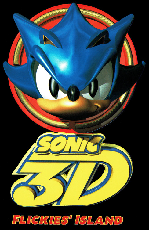
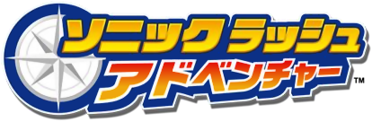
Even the spin-offs have fantastic logo design.

The best things about the logos was that while the basic font stayed the same, everything around it alluded to the game itself. 3D Blast with the 3D lettering, Sonic Adventure 2 showcasing the light and dark sides of the story, Heroes showcasing the 3 team system, Sonic Rush Adventure with the compass signifying sea exploration, Sonic Unleashed with the werehog scratch.
Jack The Nipper
Banned
This is shit. Embossed font and huge outline... No thanksThis is the best

It's also the best Sonic game. Coincidence? I think not.
Speedwagon
Michelangelo painted the Sistine Chapel. Yabuki turned off voice chat in Mario Kart races. True artists of their time.
Idk why but I like this one
This is shit. Embossed font and huge outline... No thanks
If you take away the emboss (and I guess the outline), the core design is still great. Slick silhouettes.
This is the best
It's also the best Sonic game. Coincidence? I think not.
one of the best game logos of all time
No liesThat S&K logo is still the coolest fucking thing all these years later.
This is the best
It's also the best Sonic game. Coincidence? I think not.
Man I just need a black tee with just this logo.
So fucking iconic man. Hope they incorporate it somewhere in Sonic Mania.
Telephone Man
Member

Europe cover and logo sure are interesting.
(But I honestly love the accurate recreation of Carnival Night Zone in the background.)
Crimsonclaw111
Member
Can Sonic not count? That ain't three fingers bud.
Europe cover and logo sure are interesting.
(But I honestly love the accurate recreation of Carnival Night Zone in the background.)
Not for long.This is the best
It's also the best Sonic game. Coincidence? I think not.
forknknife
Banned
Fuck, i never noticed any of this!
sixteen-bit
Member
what about a sweaterMan I just need a black tee with just this logo.
http://www.dropdead.co/collections/guys-ddxsonic/products/sk-world-tour-jumper
DarkConfidant
Member
Somehow I've never appreciated the typeface until that. Thanks for this thread.
I like that the O reminds me of Sonic either charging up, or zooming by as a ball.
I like that the O reminds me of Sonic either charging up, or zooming by as a ball.
ScientificPizza
Banned
For a while in the 00's Sonic's logo would be in Japanese in Japan.
.png/revision/latest?cb=20110906025940)
this is cool af
Anytime I see the original Sonic The Hedgehog logo I just think of Spaghettios now.
Hahaha, I ate the shit outta those Sonic Spaghettios.
Generations was better than a lot of the 2D games after S&K ¯_(� years isn't long?

") _/¯
_/¯Not to mention Rush or many of the other great 2D sonics. Come on now.
Yeah I know, just messin'Generations was better than a lot of the 2D games after S&K ¯_(ツ
Not to mention Rush or many of the other great 2D sonics. Come on now.
This is the best
It's also the best Sonic game. Coincidence? I think not.
When I was 8 years old and saw this logo in the store I knew I had to have this game no matter what.
Still an iconic box art.
The other week there was a topic about Mario Kart's 'boring' logo, but with all the Sonic excitement going on, and people continually asking 'is/was Sonic good?', I think one thing we can give Sega kudos on: Sonic's logo is timeless/
Yeah, the logo always seems to fit just right no matter what the game.
There's something about this one that always makes me laugh.

it's my original character, blaze the fire
If you take away the emboss (and I guess the outline), the core design is still great. Slick silhouettes.
Yep.
http://k1llerrabbit.deviantart.com/art/Sonic-And-Knuckles-Logo-209077359
DavidFoundation300
Banned
Every time I see that sonic adventure 2 logo I get happy remembering all the good times on GameCube.
S&K logo is still so damn great
it's the guy on the flaming hot cheetosThere's something about this one that always makes me laugh.
Jack The Nipper
Banned
If you take away the emboss (and I guess the outline), the core design is still great. Slick silhouettes.
Yeah but he said its best which sort of makes it all backwards since the other logos do what you are saying to make this one better
Can Sonic not count? That ain't three fingers bud.
Sonic can count just fine. What he's signing there is "3.1", because as we all know, Sonic 3 was actually released in two parts, Sonic 3 Part One, and Sonic & Knuckles, aka 3 Part Two.

Can Sonic not count? That ain't three fingers bud.
Maybe Sonic's German.
openrob
Member
I have never noticed the the o and c were different hahaha.
Think it's supposed to look like the spin dash