-
Hey, guest user. Hope you're enjoying NeoGAF! Have you considered registering for an account? Come join us and add your take to the daily discourse.
You are using an out of date browser. It may not display this or other websites correctly.
You should upgrade or use an alternative browser.
You should upgrade or use an alternative browser.
Mighty No. 9 [New images from INTI FESTA]
- Thread starter rockman zx
- Start date
Half of that "indie games that need more attention" thread was on KS and got a fraction of what MN9 got and look better.No it Doesn't. I have played the game and it looks good. please post examples of kick starters that look better so that we can compare ourselves.
MilkyOctave
Member
I don't get it why some of the screenshots look clear while others look like a blurry mess.
Wish they had went with a cell shading style instead, but I'm interested to see how the gameplay turns out.
Wish they had went with a cell shading style instead, but I'm interested to see how the gameplay turns out.
Please post them then.Half of that "indie games that need more attention" thread was on KS and got a fraction of what MN9 got and look better.
I don't get it why some of the screenshots look clear while others look like a blurry mess.
I imagine they were taken with phones.
Diprosalic
Banned
I wish they stuck to 2D for the characters and NPCs, and 3D for environments... Like Hard Corps: Uprising.

this looks super ugly tho.
http://m.neogaf.com/showthread.php?t=1001450Please post them then.
Have fun. I'm not gonna list a bunch of games on my phone when you can form your own opinion.
I like the look of this, are there any gameplay videos?
Plenty on youtube. http://youtu.be/PfGZD_2ZkiY
I still don't get the reaction this game's visuals get on GAF.
I think it looks good.
Even moreso it plays great. The controls feel great and the responsiveness is on point.
Psycho_Mantis
Banned
Please post them then.
Well I mentioned Dragons Crown before which had a budget of 1 million.
Yep as I thought you enjoy 2d sprite work. I don't agree that those look better just different.http://m.neogaf.com/showthread.php?t=1001450
Have fun. I'm not gonna list a bunch of games on my phone when you can form your own opinion.
InfiniteNine
Rolling Girl
It looks fine I'm not sure what everyone is going on about. I'm hoping it plays pretty good since I'm itching for some Megaman X-like game.
Plenty on youtube. http://youtu.be/PfGZD_2ZkiY
And coming to the Wii U, even better.
I bet there are no artists who could've pull off authentic Megaman look... Right?!?!?!?!
This looks so, so bad, I don't even know where to start. I guess Inafune wasn't everything. And come on, they already have some kind of fan convention? They need at least a couple of good games first
This looks so, so bad, I don't even know where to start. I guess Inafune wasn't everything. And come on, they already have some kind of fan convention? They need at least a couple of good games first
Yes and it was only on 2 platforms. Dragons crown is a beautiful game but was not a kick starter game.Well I mentioned Dragons Crown before which had a budget of 1 million.
Sir_Crocodile
Member
rockman zx makes the most depressing threads lol.
Game still looks as soulless as ever
Game still looks as soulless as ever
Yes and it was only on 2 platforms. Dragons crown is a beautiful game but was not a kick starter game.
What's that supposed to mean?
RowdyReverb
Member
Looks way better than that last round of screenshots. Looking forward to getting this and seeing how it plays compared to Mega Man
2d too much these daysI wish they stuck to 2D for the characters and NPCs, and 3D for environments... Like Hard Corps: Uprising.
Yep as I thought you enjoy 2d sprite work. I don't agree that those look better just different.
Yes and it was only on 2 platforms. Dragons crown is a beautiful game but was not a kick starter game.
I'm glad I didn't back the project, as all those conept arts kind of suggested it to be 2d, including some headers like "classic 2d action". While it might not look bad, as a 4 mio. $ project (probably more by now) it doesn't look super great either. They also cashed in 100k $ per plattform, other indies do that for a fraction of that cost.
Holy Order Sol
Member
Looking good.
abstract alien
Member
The story in those pics is already irritating me.
Different platforms effect cost and scope of projects.What's that supposed to mean?
Different platforms effect cost and scope of projects.
So you're saying porting Dragon's Crown to 2 or 3 more consoles would have tripled its budget? Ridiculous.
Starwolf_UK
Member
Perhaps this kind of a mad opinion but it feels like the design of the game has not adapted to 16:9 as in the thing it is trying to imitate (Mega Man) is 4:3 so they try to do a similar design of levels of x screens by y screens and it just leads to levels with too much spacing between objects (making it seem dull) and wide boss arenas too which could well change how those play out.
rockman zx
Member
this looks super ugly tho.
And yet the game is super fun with solid gameplay.
------
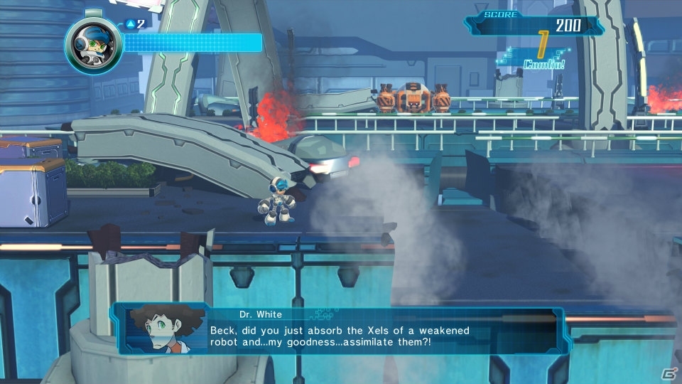
My only complain is how bad is the run animation and the proportions of Beck's body, is not like Mega Man was much different but there is something really off about Beck.


The Xtortionist
Member
That Beck icon = RIP plasma TVs 
So you're saying porting Dragon's Crown to 2 or 3 more consoles would have tripled its budget? Ridiculous.
I don't know how much it would have changed the cost but it would have increased it. Also the 1 million figure is not completely correct. His quote says the game went over the million dollar mark. I can't find a source stating the final budget on the game.
There are kickstarters that made way less money yet look way better. It's not even bad graphics. It's just a bad art style. Very muted and uninspired, and stuff doesn't stand out.
People keep saying this without posting any examples. Do you dislike the art style because it's 3d like some of the other posters or something else. I think it looks good and supports the fun gameplay that they already have down. Yes it doesn't look like the concept art but most games never do. Also please post some of these other games that look way better so we can all compare them.
Is there something I'm missing regarding why everyone is shitting on this? Is it because it doesn't look like the initial piece of pre-development concept art? If so, there was a lot of things in that concept art that never made the light of day, and I'm ok with that. The only thing that needs improving currently are the particle effects. Everything else looks ok to me.
Ah, the New Super Mario Bros. syndrome.
This has an even lower budget and, yet, it looks better imho.

It kinda is.
This has an even lower budget and, yet, it looks better imho.
Phoenix Fang
Banned
So you're saying porting Dragon's Crown to 2 or 3 more consoles would have tripled its budget? Ridiculous.
I take it you don't work in the game industry because yes it can happen. I'm not saying it happened with the game.
This has an even lower budget and, yet, it looks better imho.
That looks like a flash game and ugly.
I don't know that it looks bad. I kind of dig it. I don't know what folks are expecting.
I *DO* wonder how they'll deliver on the 3DS and Vita versions, though, since the game is UE3. I guess Vita can support the engine but not all that well - 3DS though? Surely they'll have to build out a different version of the game on that platform.
I *DO* wonder how they'll deliver on the 3DS and Vita versions, though, since the game is UE3. I guess Vita can support the engine but not all that well - 3DS though? Surely they'll have to build out a different version of the game on that platform.
I take it you don't work in the game industry because yes it can happen. I'm not saying it happened with the game.
Please enlighten me with a few examples where this has happened.