Iva Demilcol
Member
This cosplayer did it right:

just google "ridiculously photogenic joker"
just google "ridiculously photogenic joker"

They literally wrote DAMAGED on his head.
How did no sane person in the production look at it and say, 'wait, this is fucking awful'?


the dark knight joker conceptual

I don't remember this at all.I'll be honest: Ledger's joker is still a terrible design. There's a reason people balked at it when they first saw it; he sold it 100% on the strength of his performance, while the aesthetic design remained completely terrible through and through.
Not, like, Jared Leto wangsta Joker terrible, mind, but it's still low-tier design work.

I have a soft spot for Brave & the Bold's Joker design because just about everything about that show is underrated and underappreciated as fuck.
This cosplayer did it right:
just google "ridiculously photogenic joker"
And I personally really, really liked Kevin Michael Richardson's performance. Very high energy, and could turn it up even higher or tone it down appropriately. He could really do a less refined and less mafia bossy Joker.
Weighing on on the bad ones... I'ma go with staple-face Joker as the worst:
People are in here criticizing the DAMAGED, and for good reason, but even that looks clever and subtle compared to faceless Joker. It's contrived, trite, and gratuitous.
Spoopy
Lee Bermejo Joker is one I've always been partial to. It's the basis for the Ledger Joker:


I don't give a fuck that he is Cesar Romero, shave the 'stache for the role, dude:
How bad would Leto's Joker be if it didn't have the grill and damaged?
The smile tattoo he has on the back of his hand was particularly stupid for me. The way he put it up to his face...Still ultra bad. Walking around growling at everything and his over extended animations and features for every action he did was groan worthy.
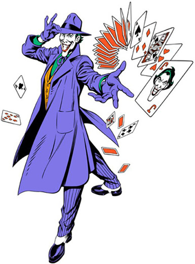
imma go Bruce Timm's purely because I think his version of The Joker is the most recognizable and he brought it down to basics, you'd recognize him just by silhouette


Best

Worst

People are in here criticizing the DAMAGED, and for good reason, but even that looks clever and subtle compared to faceless Joker. It's contrived, trite, and gratuitous.
Spoopy
In his defence you probably couldnt see the stache in SD back in the day
Giving a nod to Norm Breyfogle Joker.
Leto Joker is a mixed design. I like some parts, hate others, but I don't mind the attempt - Suicide Squad has this weird "faux-gangsta" feel to its characters and he fits that world.
Absolutely awful performance though. Just bafflingly bad. Between that and Lex Luthor is was a rough year. But on sheer design merits? I can live with it.
The best, though? Shout-out to Gotham Central. There's something super unsettling about a pudgy, middle-aged man in clown makeup. If you go too far, he's just "scary" and you lose the uncanniness. He's a wolf in sheep's clothing to the Nth degree.
I would kill to see a movie design for the Joker that was similar to this.
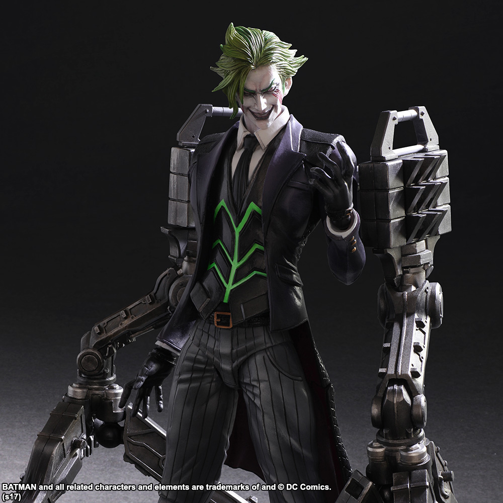
Tetsuya Nomura knows what's up (also Yoshitaka Amano below, but that's Final Fantasy)