-
Hey, guest user. Hope you're enjoying NeoGAF! Have you considered registering for an account? Come join us and add your take to the daily discourse.
You are using an out of date browser. It may not display this or other websites correctly.
You should upgrade or use an alternative browser.
You should upgrade or use an alternative browser.
Best redesign of a classic character
- Thread starter SolVanderlyn
- Start date


Vulcano's assistant
Banned
REmake did an amazing job.

Little surprised this hasn't been posted yet.

A lot of them are different characters tho.
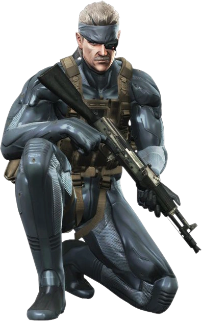
Even still, I think MGS1 Solid Snake might be the coolest looking one. Even though Old Snake was PRETTY rad.
JumpCancel
Banned
20 minutes into las plagas and chill and he gives you this look
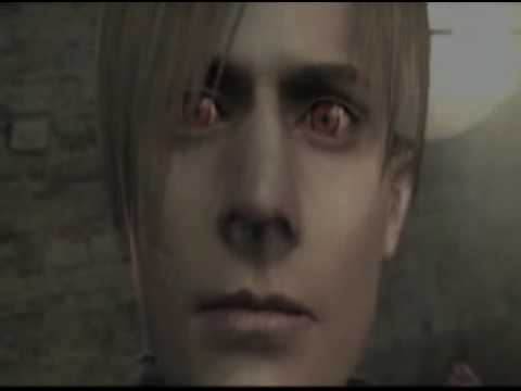
Actually laughed at this. What a face.
DMC4 Dante is good but the best Dante is DMC2 Dante
such a shame that its the worst game in the series.
tallbroski
Member
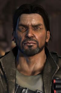
Capcom did an amazing job with their characters (expect steroid Chris urghh) My faves
to

Claire
to

to
Claire
to
From:

To:

Man this so much and Terry Bogard as well but god Soul Reaver Kain was a masterpiece.
thesolidshark
Member
Terry Bogard, Garou: Mark of wolves. Way to take an iconic character already, and make him better. SNK is the best in the business at character design.
(MGS4 & MGR Raiden) Both are awesome. Rising redesign tho so good
These are my favorites for sure, besides MGS4 Old Snake
ninjablade
Banned


Holy shit,that's a huge difference.


")


Muppet of a Man
Member
Pit from Kid Icarus.
.png)
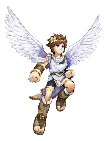
The new design is so much worse. Original design on left is way better. Same for almost all Nintendo characters (including 80s link as mentioned before).
Zeuanimals
Member
Smash is generally great for character redesigns.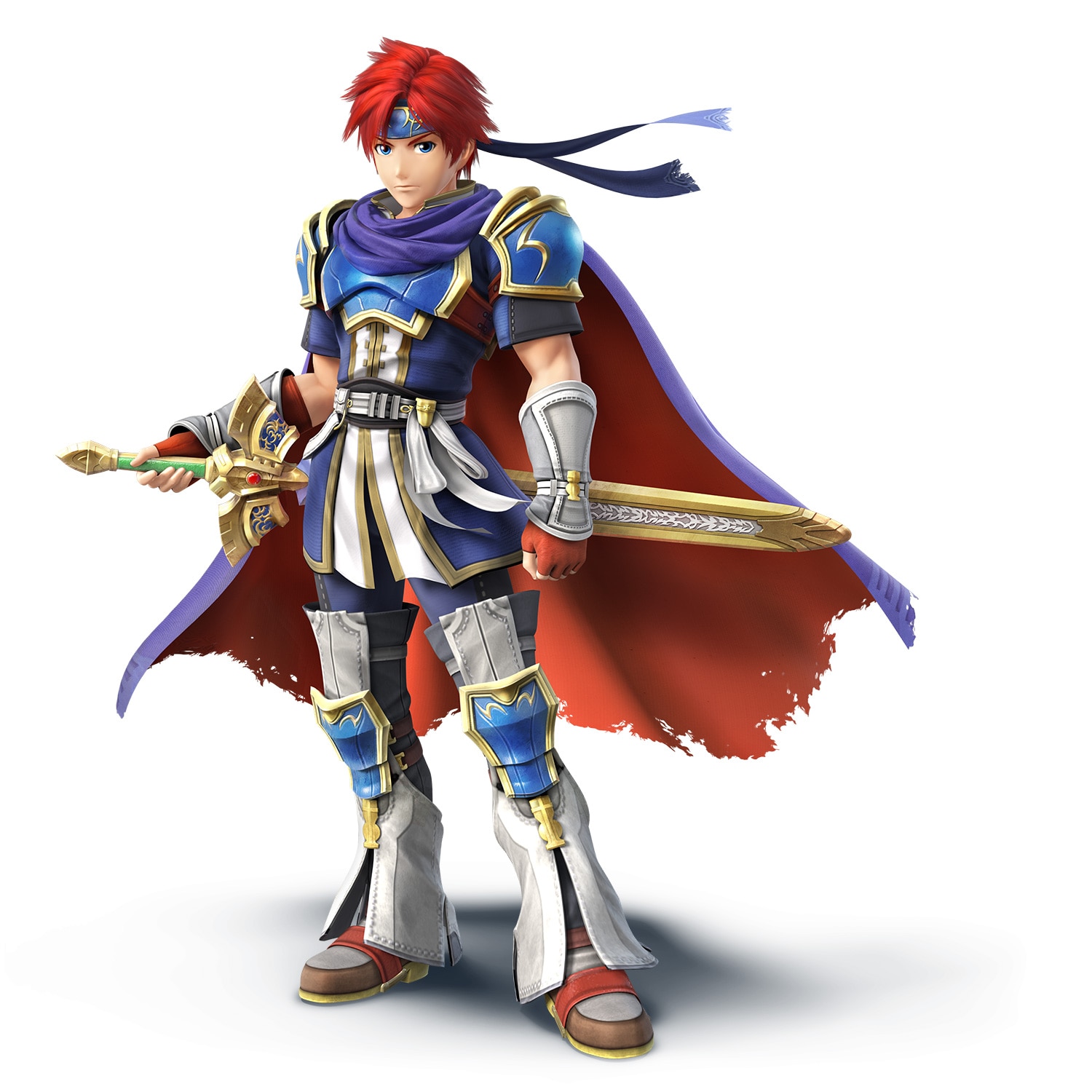
Take a look at what they did to Roy
Looks great except for those flared out legging things. They're dragging it down a bit.
JediLink
Member
Well you're wrong. Also wrong because OoT design is better.Well, he was awesome looking to begin with, but now he's much more detailed. Also, if I'm being completely honest, maybe it's a shame they got rid of his masculinity, because I'm convinced during Ocarina of Time.Zelda was actually transformed into a man to trick Ganondorf, not just adopting the appearance of one
Chaotic-Strike
Banned
The new design is so much worse. Original design on left is way better. Same for almost all Nintendo characters (including 80s link as mentioned before).
The new design is by far the better design, but I did like how they had a nod to classic Pit in that anime short.

I wouldn't mind to see it in game form.
Dang, Witcher 3 Geralt is like 78% more approachable.
potatohead
Member
Lara Croft:
Not as good as this IMO:
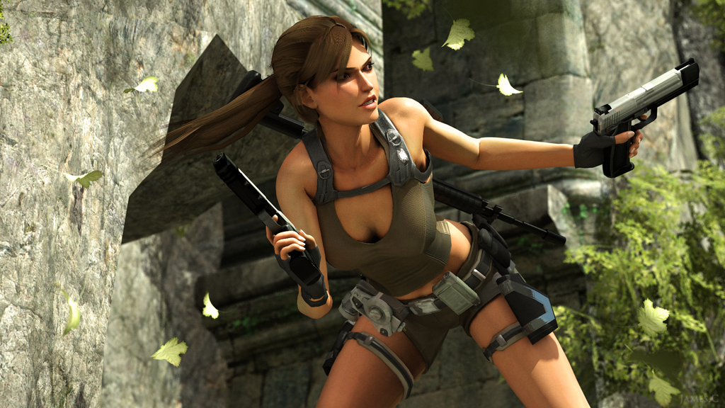
TR Underworld Lara was the best Lara IMO.
Won't hide it, the PS2 trilogy was my favourite of all TR games.
New series is trash to me.
Dang, Witcher 3 Geralt is like 78% more approachable.
If I remember right, Witcher 1 Geralt's more accurate to the book look where they shouldn't really look approachable. CDPR took more liberties with W2 and W3.
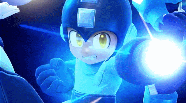
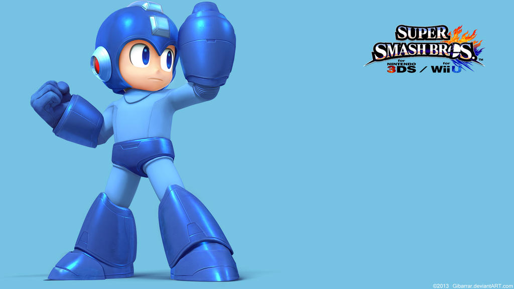
While I always love Mega Man 8 for it's art direction and how beautiful the game looks, I do love Super Smash Bros. take on the Blue Bomber. It's a great recreation of his NES design, and a fairly minimalistic update overall. It's interesting that Rock in this game looks and acts more like an emotionless combat robot, which is not a bad thing to say.
That's not to say that he hasn't lost his cuteness, though.

That's not to say that he hasn't lost his cuteness, though.
potatohead
Member
I have to be honest I hated that re-design.
Made him a generic looking bulky nonsense character that belongs in the WarCraft universe.
In the original he looked like a real rebel soldier dude.
Doesn't really help that the SC2 story is a rehash of every other Blizzard story either and even worse was told in a completely trash way but oh well.
Chezzymann
Member
I dunno... those dead eyes. Its like he's a robot.Megaman in Smash Wii U/3DS
So cool.
CountAntonius
Member
Eli Vance
Hal Life
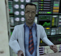
Half Life 2

Half Life 3

Hal Life
Half Life 2
Half Life 3
I have to be honest I hated that re-design.
Made him a generic looking bulky nonsense character that belongs in the WarCraft universe.
In the original he looked like a real rebel soldier dude.
Doesn't really help that the SC2 story is a rehash of every other Blizzard story either and even worse was told in a completely trash way but oh well.
Yeah, they really could have done a better job of connecting SC2 Raynor's look to SC1 Raynor.
Se7enSword
Banned
Is there a good shot of his design in VIII? I haven't kept in track with the game for a while heh, but there doesn't seem to be little to nothing beside the trailer.
Yeah, the trailer is the only source.
No hoodie itself is a huge improvement.
Yeah, it's pretty great except for that weird clothing in his legs.Smash is generally great for character redesigns.
Take a look at what they did to Roy
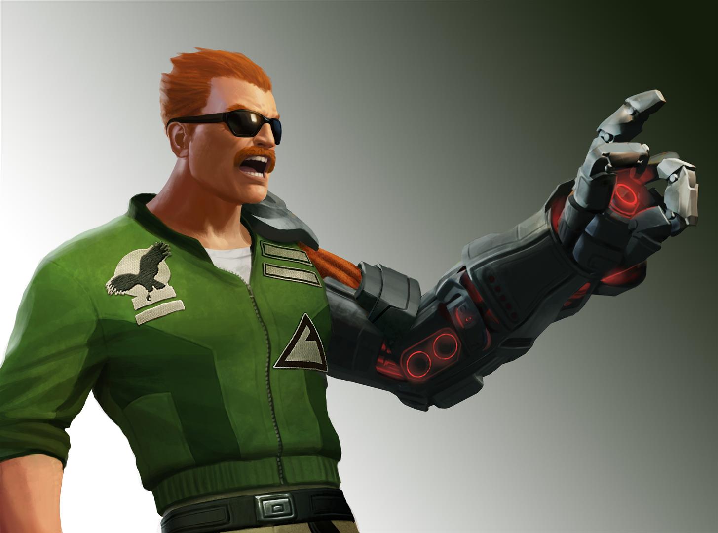
Andy Believes
Banned
I love how Nathan Drake has changed over the course of the series. The redesign for Uncharted 4 looks phenomenal.


Came here to post this.

Slamtastic
Member
he's fat
that doesn't look like a man who punches people in the face while yelling or delivers mid air chokeslams
It's like Nomura forgot everything he knew about drawing. This version of Cloud looks like it's made of wax and about to melt. The expression, posing and the complete breakdown of his anatomy reflect it too.
What a sad piece of work.
Dang, Witcher 3 Geralt is like 78% more approachable.
And 67% more generic and forgettable.

:3
people gonna hate me but i LOVE Clouds newer look...
Original:

Dissidia (which is almost exactly the same as original with some minor alterations
http://i.imgur.com/HaqliXr.png[/]
But Kingdom Hearts version is my all time favorite:
[img]http://i.imgur.com/q7MiJVr.png[/]
(With Advent children as runner up)
[img]http://i.imgur.com/5V2ghdx.png[/][/QUOTE]
I understand the choices behind some of the designs, but I don't think any of them does a particularly good job in depicting Cloud in his original form. His design in the new Dissidia is where it's at.
[quote][img]http://i.imgur.com/nWc7kOq.png
Morrigan Stark
Arrogant Smirk
Impa in Hyrule Warriors looks pretty amazing. Actually I think I prefer the HW designs of pretty much all of the classic Zelda characters. Many of the original characters suck though (Cia most of all).
Geralt isn't a "classic character", but oh well, most definitely an improvement. He looks atrocious in TW1, lol.
I am convinced people posting DmC's Dante are trolling. I am not a fan of the original Dante at all but ewwww.
All of the Cloud redesigns are garbage. Tifa is an improvement in Advent Children though.
Basketball
Member
Capcom did an amazing job with their characters (expect steroid Chris urghh) My faves
Claire
to

absolutely disgusting.jpg
Banana Aeon
Member
I'll take generic over looks like shit any day of the week.And 67% more generic and forgettable.

Shinobi PS2's ninja is a new character, not a redesign.
chaobreaker
Member
Loved Jaheira's redesign from BG to BG2:


Redesign has a lot more personality and detail, as opposed to "generic hot human (who's supposed to be a half-elf) brunette".
Weren't a lot of the BG1 portraits inspired from real life people related to then-Bioware developers?
Yeah I really like this one.

chaobreaker
Member

1. The first sprite is not even Rad. That's Super Joe from the arcade Bionic Commando. You know, the guy Rad is trying to rescue in the completely different NES game?
2. The second and third spirtes are from the same game.
GrotesqueBeauty
Banned
What I learned most from this thread is that taking an existing character and putting them in a leather jacket with a fur turn-down collar = great redesign.
I personally liked the Lara Croft design from Legend/Anniversary. It captured the spirit of the original without the angularity and big headed awkwardness of the TR 1-3 renders. I felt like the 2012 reboot messed up by ditching the high cheekbones and wide set almond shaped eyes. I know they were shooting for more "realism", but they threw the baby out with the bathwater and dropped some defining characteristics that made her more than just your average young model with a tank top and some dirt on her face.
I personally liked the Lara Croft design from Legend/Anniversary. It captured the spirit of the original without the angularity and big headed awkwardness of the TR 1-3 renders. I felt like the 2012 reboot messed up by ditching the high cheekbones and wide set almond shaped eyes. I know they were shooting for more "realism", but they threw the baby out with the bathwater and dropped some defining characteristics that made her more than just your average young model with a tank top and some dirt on her face.
Slamtastic
Member

For being such a simple change, this redesign really makes Dhalsim feel more "believable" as a person than he ever did before.
thesonovabeach
Member
I actually liked this redesign of Spyro:

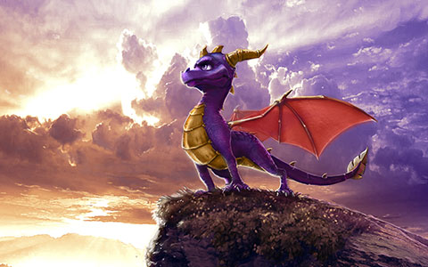
The second artwork is incredible.
TheRedSnifit
Member

To:


PfantzyPantz
Member
Wow I really prefer old Pit and Palutena, didn't know they looked like that.
My answers are the typical Killer Instinct and MKX, they did an amazing job.
My answers are the typical Killer Instinct and MKX, they did an amazing job.
KZXcellent
Member

Really it wasn't gonna be hard to top Sora's KH1 outfit. I'm starting to really like his new look for KH3. The plaid is hilarious.
If I remember right, Witcher 1 Geralt's more accurate to the book look where they shouldn't really look approachable. CDPR took more liberties with W2 and W3.
Honestly I'm happy they took liberties. Geralt in Witcher 1 is just... horrible looking. Like it looks like his eyes are ready to pop out at any second.
TriAceJP
Member
Not as good as this IMO:
TR Underworld Lara was the best Lara IMO.
Won't hide it, the PS2 trilogy was my favourite of all TR games.
New series is trash to me.
I thought the new game was great, but yeah man that trilogy was awesome. I'm with you.