Dice//
Banned

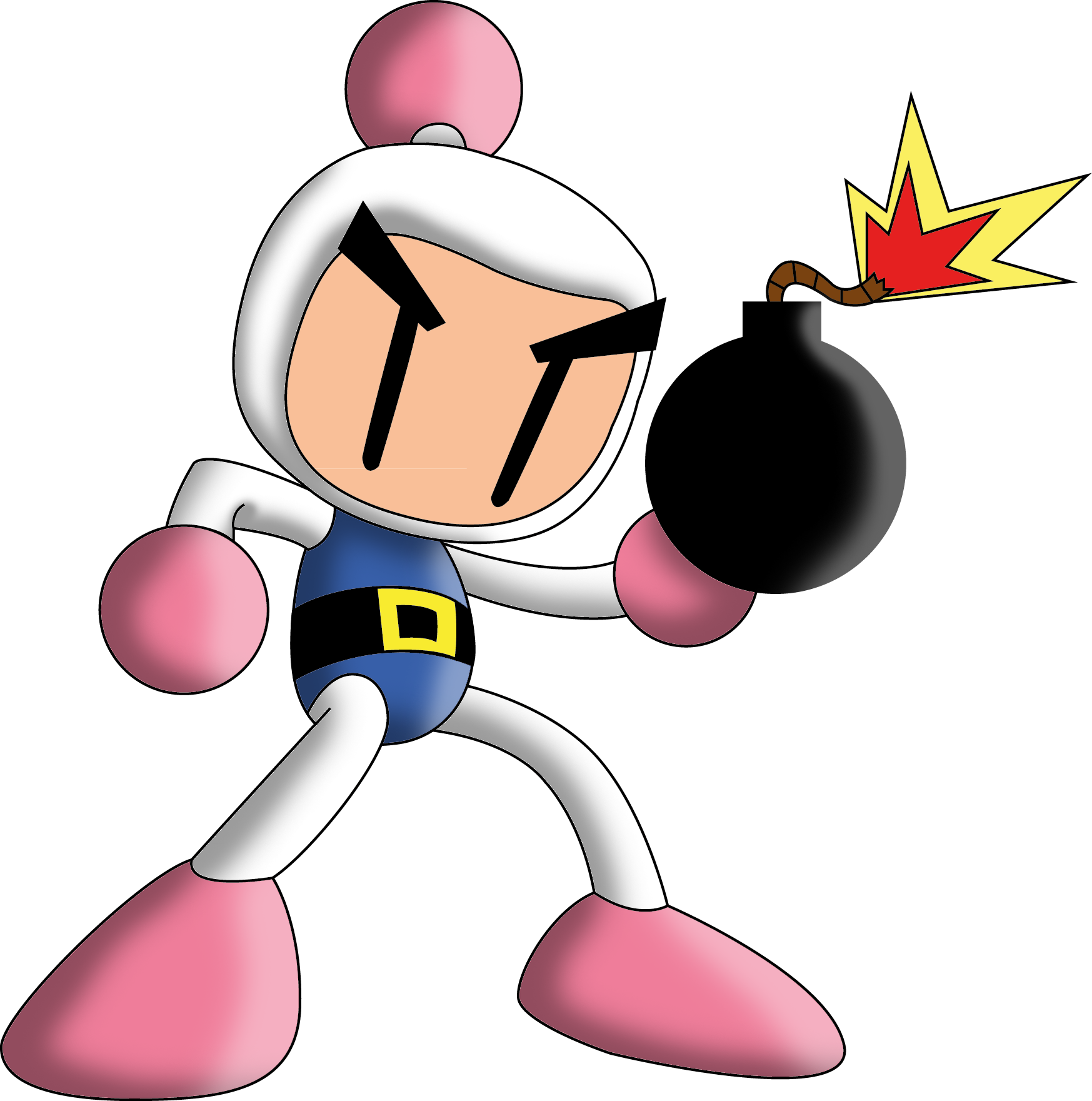
Really it wasn't gonna be hard to top Sora's KH1 outfit. I'm starting to really like his new look for KH3. The plaid is hilarious.
I quite like the hair evolution...
KH1 - Natural
KH2 - FROSTED TIPS
KH3 - Ombre (look it up)
Really it wasn't gonna be hard to top Sora's KH1 outfit. I'm starting to really like his new look for KH3. The plaid is hilarious.
Fucking amazing redesign that hit all the right spots.
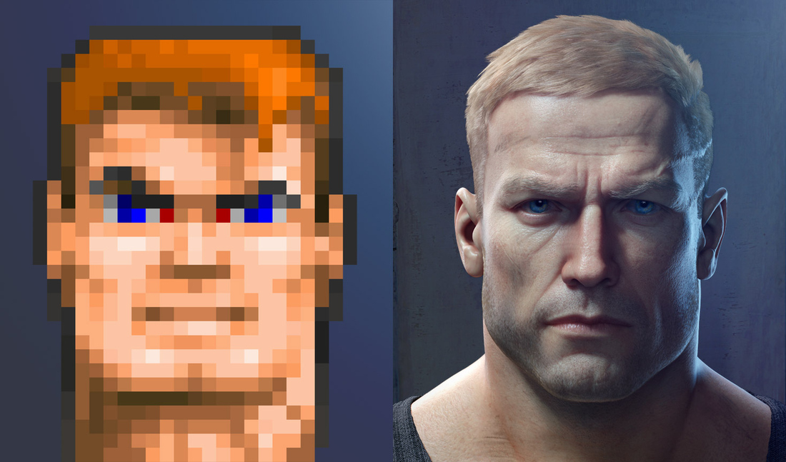

Yeah they really nailed the generic marine look....
Not hating on BJ but come on guys... xD
I dunno... those dead eyes. Its like he's a robot.
The Wind Waker Ganon is like Kingpin to me.he's fat
that doesn't look like a man who punches people in the face while yelling or delivers mid air chokeslams
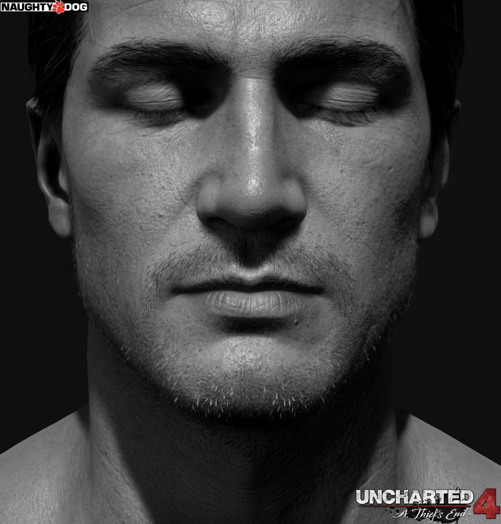
I love how Nathan Drake has changed over the course of the series. The redesign for Uncharted 4 looks phenomenal.


Worst redesign is Sweet Tooth from Twisted Metal. TM2 Sweet Tooth is top tier!


That smile, too.I mean sure he's "generic marine" as he should be but idk its just something about the design. Its fucking good and isnt forgettable. There a million marine dudes whose faces all blend together but the new BJ sticks out.

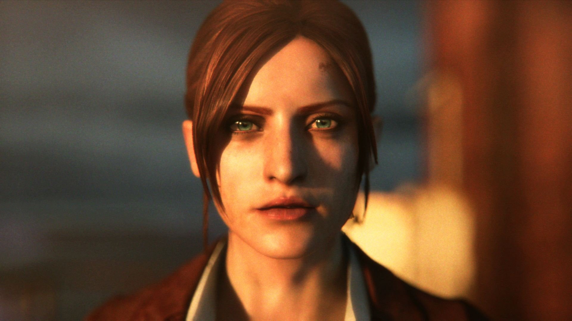
Revelations 2 Claire is best Claire.

This right here, really wish this was her default outfit.This one right here.
Just perfect.
Same could be said about this. The default WoL design is pretty nice but this is simply amazing. Translates that tiny red sprite into a modern FF character perfectly.Warrior of Light, Dissidia

Say what you will about Nomura, but I think he did a pretty great job of translating that sprite into a modern FF design.
Eli Vance
Hal Life

Half Life 2

Half Life 3

How is that a re design?How has no one posted the correct answer yet?
How is that a re design?
Not different people, cartoonish versions tethered to that tech that now look much more human and realistic.Not exactly a redesign, but I really like how Geralt has kept the same recognisable likeness over the years as CDPR's graphical tech has improved:
Well, Witcher 1 Geralt is kind of a monster, but the basic facial structure carried over, and then 2 and 3's Geralt's look like the same guy but rendered at different qualities. By comparison, it seems like Naughty Dog really doesn't care about likenesses. When they improve their graphical tech they just redesign their characters into totally different people:
And that's comparing the U4 cast to the U3 cast, who already didn't look quite right.
I mean sure he's "generic marine" as he should be but idk its just something about the design. Its fucking good and isnt forgettable. There a million marine dudes whose faces all blend together but the new BJ sticks out.

absolutely disgusting.jpg
Sub Zero from Mortal Kombat Deception was cool as hell.
God damn. That's all I'm going to see now.
absolutely disgusting.jpg
absolutely disgusting.jpg
Terry Bogard, Garou: Mark of wolves. Way to take an iconic character already, and make him better. SNK is the best in the business at character design.
Anything is better than Rev 2 Claire. Darkside Chronicles is the best, though.
DS > Code: Veronica > RE2 > Degeneration > random deviant art scribbles > Rev 2
Claire, age 19

Funny you mention this, because Rev 2 Claire looks exactly like an aged Darkside Chronicles Claire to me.
Besides the different nose, lips, jawline, and ears, they have similar eyebrows for sure!
Come on.
It's similar enough to look like the same character with an updated look. It's not like they gave her a double chin.
Technically not the same character, but you get the idea.
Prince Of Persia
god i loved PoP 2008, im not alone right? that game was fucking beautiful... i want more water colored Nolan North Prince.
Fucking amazing redesign that hit all the right spots.
Great, great game.god i loved PoP 2008, im not alone right? that game was fucking beautiful... i want more water colored Nolan North Prince.
god i loved PoP 2008, im not alone right? that game was fucking beautiful... i want more water colored Nolan North Prince.
Donkey Kong is too obvious an answer for me so for varieties sake and even greater controversy potential...

Simon and Trevor Belmont
Simon especially benefits from his Mirror of Fate redesign byt tying the classic barbarian look with the red hair of the rather bishonen looking chap from the PS1 days.
Basically I find it the best of both worlds.
Trevor gets a classy coat though I think his original design technically has it as well, except his NES sprite just looked like Simon Belmont so it's less known.
Also from the ever divisive design shifts of B&K Nuts and Bolts...
Jolly Roger as a classy hobo.I also am growing to like the redesigns of B&K themselves
So extreme was this transformation it took me a while to realise it was the same character, Ieyasu the boss.
Megaman in Smash Wii U/3DS
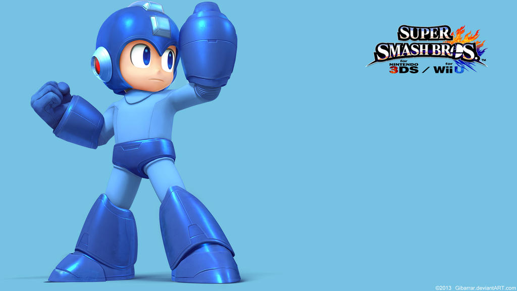
So cool.
Right answer, wrong redesign.
REmake Jill (and her RE3 version) is seriously one of the best character designs in gaming. I guess I'm a fan of RE designs in general - but Leon and younger Jill are top tier. Chris fared much better than Jill in RE5, though. Although her RE5 self is still leagues above her Revelations design.