like itARC Euro said:from junior member Tapio

thx!
")
like itARC Euro said:from junior member Tapio
thx!
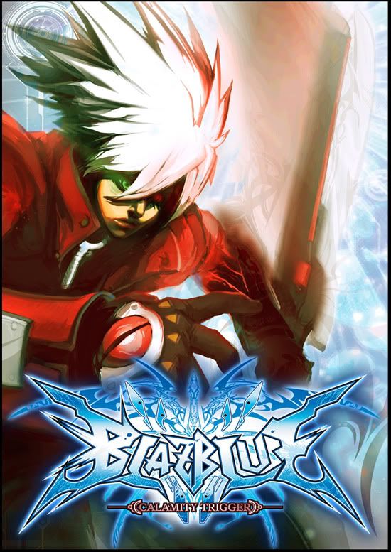
radiantdreamer said:Just finished this one. Not all that happy with it, but I wanted to get the idea out of my system.
http://i910.photobucket.com/albums/ac301/radiantdreamer/blazbluecover3.jpg[IMG][/QUOTE]
[IMG]http://www.doodstormer.zoomshare.com/files/over9000ry4.jpg
Just kidding, looks great.
Katana_Strikes said:http://www.biggerbids.com/members/images/15877/public/976781_tapio-blazblue01.jpg[IMG]
Another really nice one.
Not keen on any of this arty stuff, I have to say. For the boxart I mean. It's all very nice in it's own right though.[/QUOTE]
yeah, but it seems that that is what Arc Euro was looking for - GAF Collection style cover art.
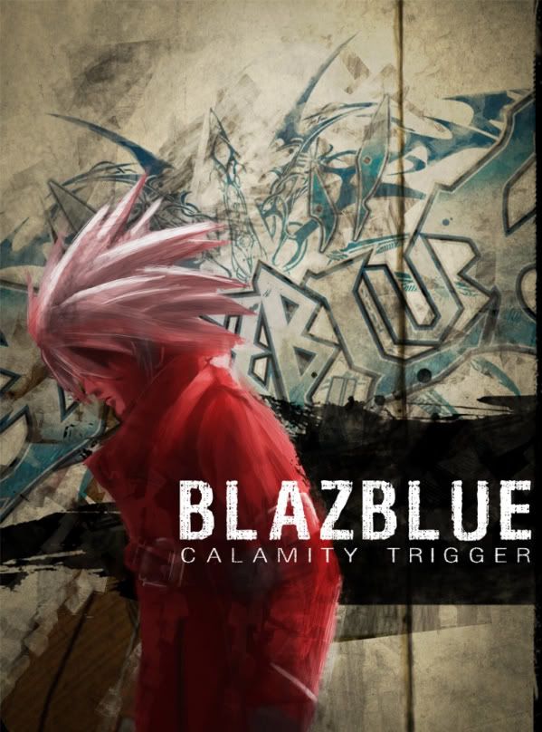
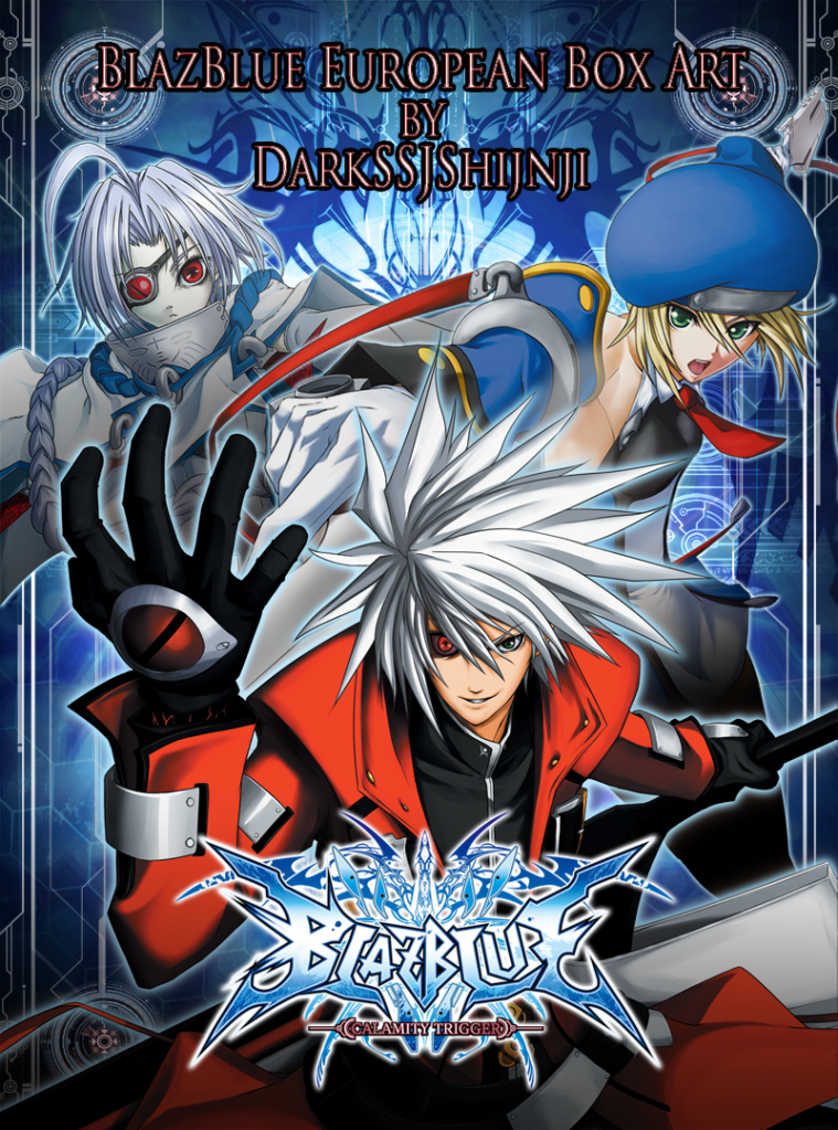
radiantdreamer said:Did a second iteration with the official logo in it by turning the abstract background into a graffiti wall.
It adds a little bit to it, but I'm not sure if it's too distracting or not...
...radiantdreamer said:Did a second iteration with the official logo in it by turning the abstract background into a graffiti wall.
It adds a little bit to it, but I'm not sure if it's too distracting or not...
SWEET JESUS.radiantdreamer said:Did a second iteration with the official logo in it by turning the abstract background into a graffiti wall.
It adds a little bit to it, but I'm not sure if it's too distracting or not...
oh shit, what? I gave up and never came back to the thread until now :lolRaging Spaniard said:You got a week or so left dude, plenty of time to whip something out.
Please submit your drawing in .pdf or .jpg format before the end of September.
blergh!Original due date of end September has passed..
Due to some request of extension of submission, we would like to keep it open until end of next week.
Meanwhile, we will prepare the voting mechanism!
radiantdreamer said:Did a second iteration with the official logo in it by turning the abstract background into a graffiti wall.
It adds a little bit to it, but I'm not sure if it's too distracting or not...
radiantdreamer said:Did a second iteration with the official logo in it by turning the abstract background into a graffiti wall.
It adds a little bit to it, but I'm not sure if it's too distracting or not...
I think we have our winner.radiantdreamer said:
radiantdreamer said:Did a second iteration with the official logo in it by turning the abstract background into a graffiti wall.
It adds a little bit to it, but I'm not sure if it's too distracting or not...
So here we are. I'm finally finished. And so is my box art.so1337 said:edit: Sorry, guys. Took my submission out (for now). Wasn't quite happy with it.


radiantdreamer said:Did a second iteration with the official logo in it by turning the abstract background into a graffiti wall.
It adds a little bit to it, but I'm not sure if it's too distracting or not...
radiantdreamer said:Did a second iteration with the official logo in it by turning the abstract background into a graffiti wall.
It adds a little bit to it, but I'm not sure if it's too distracting or not...
Sword Familiar said:I suspect people are joining GAF solely for the chance of winning a free game. Kind of takes the point out of making it a "GAF only" contest imo.
Edit: Sure, it adds to the total number of members, but will these members be active(?), and why not announce the contest somewhere else if anyone can participate?
Anyway, it's almost over anyway so I guess it doesn't matter if we get a few new contributions.
radiantdreamer said:Hmmm... now that I think about it, you're absolutely right about that.
It's nice to see new entries, and some of them are pretty sweet, but it does defeat the purpose of it being a gaf only contest.
I thought I was doing someone a harmless favor, and never thought about how it would actually impact the contest. Arc Euro should decide what to do then.
I'm so excited!
OatmealMu said:
Darkpen said:I'll be honest, modus, I don't like his face. At all. And his hair, too. I like everything else that doesn't suffer uncanny valley, like the hand, and the more graphic-design aspects of it, but the face and hair just sucks. The nature of the shading and how his face and hair is drawn is at complete odds with the rest of his design. If it looked more uniform in terms of "brush strokes," if you will, then I think it would look more slick.
Also, his face reminds me too much of that one Japanese actor who's been in Death Note and Battle Royale. He has a really meh face :/
On a different note, unless this contest gets extended again (lol), I don't think I'll be able to make an entry. Found out about the contest too late, and I can't think of anything awesome that isn't artist brain farting.