-
Hey, guest user. Hope you're enjoying NeoGAF! Have you considered registering for an account? Come join us and add your take to the daily discourse.
You are using an out of date browser. It may not display this or other websites correctly.
You should upgrade or use an alternative browser.
You should upgrade or use an alternative browser.
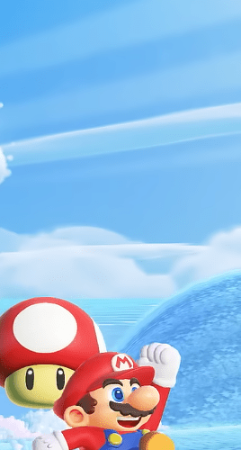
Super Mario Wonder Announced - Coming 20.10.2023 | Nintendo Direct
- Thread starter KyoZz
- Start date
MirageMew2
Member
“Super Mario Wonder” totally sounds like it could’ve been a 3D follow up to Odyssey. Should be great nonetheless
Badlucktroll
Member
what are those talking things that egg mario on
Astral Dog
Member
Its Super Mario Bros. Wonder“Super Mario Wonder” totally sounds like it could’ve been a 3D follow up to Odyssey. Should be great nonetheless
VeganElduderino
Member
Mario as been eating a bit too many Amanita muscaria, looks good!
KXVXII9X
Member
"Animations look super cheap"The graphics and especially the animations look super cheap. Also, what's the deal with 2D Mario games without proper flying mechanics?


{insert code here}
Member
This is going to sell 40M copies easy. Not my type of game but, mad respect for Nintendo focusing/investing on mechanics and gameplay instead of muh lifelike graphix.
DonkeyPunchJr
World’s Biggest Weeb
Looks fun, my kids went apeshit when they saw the trailer.
abstract alien
Member
Damn it almost looks like the Nintendo Power cover from years ago. This will definitely be a day one purchase. Shit, a day one preorder.
Also, I never thought NSMB looked bad artistically. I liked the clean designs and colors *shrugs*
Also, I never thought NSMB looked bad artistically. I liked the clean designs and colors *shrugs*
GeeseGoose
Member
Everything looked spectacular, aside from one tiny thing... the voice and "personality" of those yellow flowers is disgusting.
Hardensoul
Member
Is there a limit on the vouchers? I already used the $100 voucher this year on Totk. Can I buy another $100 voucher?I know what I am going to use my other voucher on.

We back to the Sega Genesis vs Super Nintendo era.New 2D side scrolling Sonic game.
New 2D side scrolling Mario game.

Sorry, couldn't resist.
Probably buying both.
AJUMP23
Member
$100 gets you 2 vouchers. So you should have another one. I used one on TOTK as well.Is there a limit on the vouchers? I already used the $100 voucher this year on Totk. Can I buy another $100 voucher?
AMSCD
Member
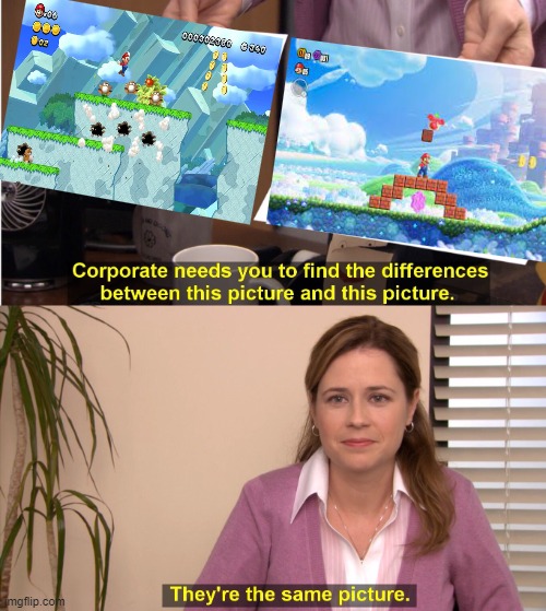
Ya I'm with you. The game looks fun but I am confused by people saying that the art style looks different. It's just a bit more sparkly.
bender
What time is it?
Ya I'm with you. The game looks fun but I am confused by people saying that the art style looks different. It's just a bit more sparkly.
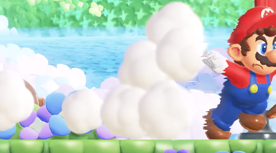
The animations on characters and enemies are way more expressive and environmental touches like clouds dispersing when you jump through them. You can definitely see the modern 2D Mario roots which is disappointing, for me at least, but it does look like a decent evolution. I still want to see more as I was excited about the painted world in New Super Mario Brothers U but that concept was fairly underused.
NanaMiku
Member
Woah, pretty nice box art. The PNG pattern is a nice touch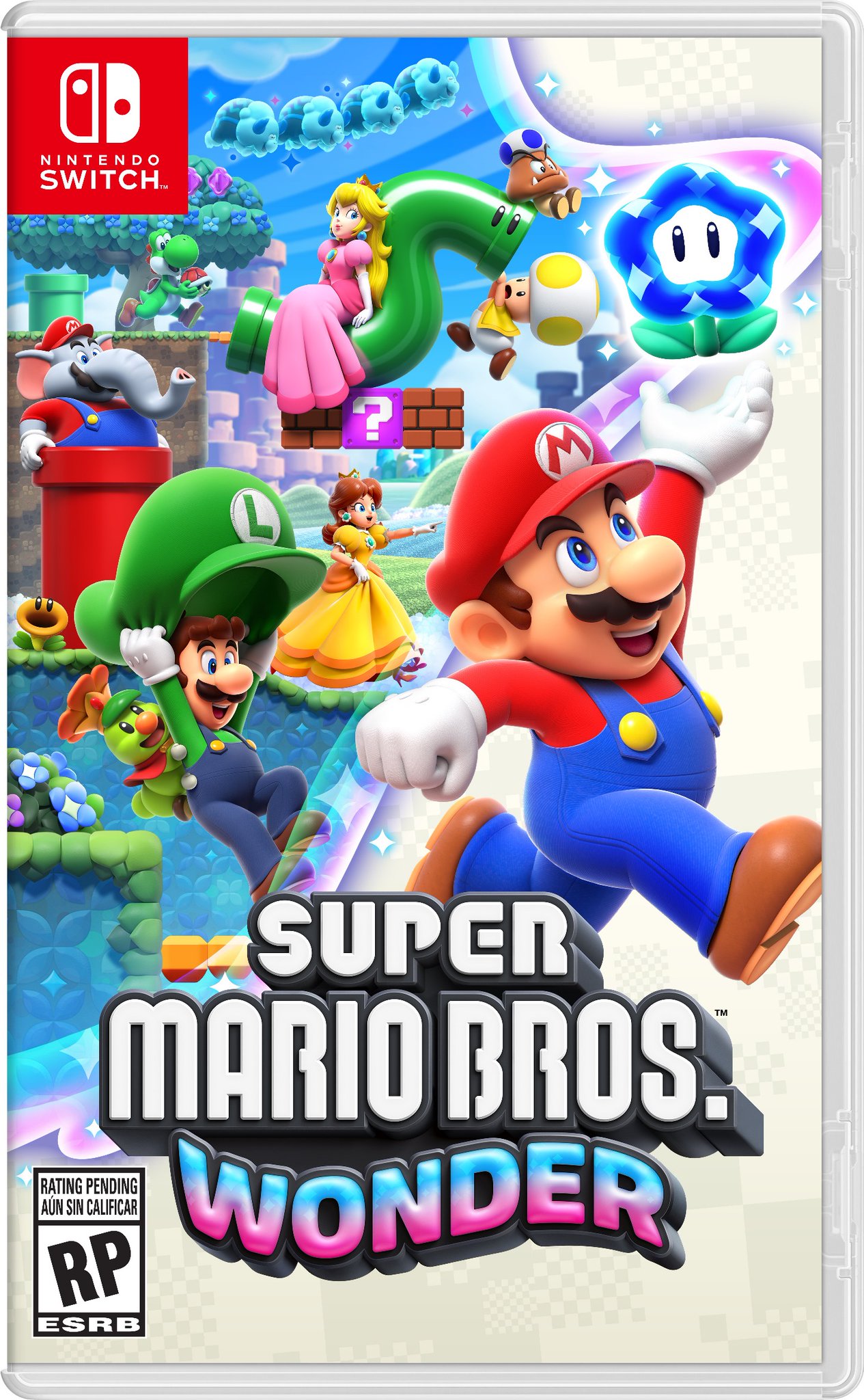
Fresh.
$100 get you 2 vouchers. Each voucher can be used to redeem one game. So if you use the voucher only for TOTK, you should still have one more voucher than you can use. There's no limit on how many voucher you can buyIs there a limit on the vouchers? I already used the $100 voucher this year on Totk. Can I buy another $100 voucher?
NanaMiku
Member
Oh yeah, I forgot about this. it's 1 year IIRCVouchers do expire though.
93xfan
Banned
Yeah, I miss the verticality and discovery with either the leaf or feather.The graphics and especially the animations look super cheap. Also, what's the deal with 2D Mario games without proper flying mechanics?
Still think I’ll have a good time, and art wise is a step up from the “new” series
Stratostar
Member
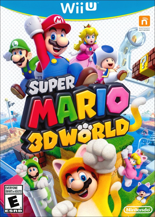
Gonna nitpick because I'm on a video game forum. Boy do I hate all that white empty space. Why leave all that space effectively blank on the cover? Looks unfinished. They did the same thing with 3D World's Wii U box art. I remember in its box art thread (from 10 years ago lol) one user's quick photoshop job made a world of a difference, as you can see here:
From this
To this

Jubenhimer
Member
It looks similar in some ways. But the character models, animations, and overall aesthetic have been completely overhauled.Ya I'm with you. The game looks fun but I am confused by people saying that the art style looks different. It's just a bit more sparkly.
IAmRei
Member
as for racing, i can only do mario kart and ridge racer, back before i tried GT 4, and not touching others after that anymore, knowing todays racing should be more complex than beforeTotally feel you, it happens to me with racing sims, even more arcade-y Forza Horizon is too difficult for me, I felt like an accomplishment doing a lap without crashing once but then I had to do the same fast to win the race and gave up lol
Sleepwalker
Member
I feel sorry for those that can't enjoy things like this because of the graphics or whatever. This game looks like its gonna be so much fun.
existensmaximum
Member
Ye
Yeah without the feather the series reminds me too much of the limitations of Super Mario Bros (1). So it's such a step back, the series didn't get great until Super Mario Bros 3 imo.Yeah, I miss the verticality and discovery with either the leaf or feather.
Still think I’ll have a good time, and art wise is a step up from the “new” series
existensmaximum
Member
Yeah, the movement looks almost interpolated? It's hard to describe what I mean."Animations look super cheap"
Feel Like I'm On 42
Member
Really surprised to see comments that this is so much better than nsmbu deluxe. To me the art styles are extremely similar. This looks a little better of course but more of an evolution
Feel Like I'm On 42
Member
Is there a limit on the vouchers? I already used the $100 voucher this year on Totk. Can I buy another $100 voucher?
You sure can
Feel Like I'm On 42
Member
I'll probably buy a voucher for this and .. Mario rpg?
It's hard to agree with the notion that the game is getting criticised simply because it's stylised when the game looks nearly identical to New Super Mario Bros. series aesthetically.Probably around the same amount that think "realistic > stylish" and "individual pixels > whole composition", which is common here at least, a matter of tastes.
Last edited:
Aldric
Member
Game looks pretty great, for the first few seconds I was annoyed at how similar it looked to NSMB but after watching the entire trailer I quickly changed my mind, it has a ton of meaningful improvements and its own unique identity that no other Mario game share. Much better lighting, more pastel colors, a much softer look compared to NSMB's plasticky style, grander, more detailed backgrounds with a lot of things happening in them and of course really charming animations giving characters a lot of personality. People saying that the games look the same are delusional.
Also something exciting to consider: the game already looks very creative but keep in mind most of Nintendo's major titles, especially mainline Mario games have pretty tame first trailers followed by a second one that unveils some batshit insane core mechanics. Just compare Odyssey's first trailer to the E3 2017 one. I'm pretty sure we haven't seen anything of the game yet and that there's some really off the wall stuff in there.
Also something exciting to consider: the game already looks very creative but keep in mind most of Nintendo's major titles, especially mainline Mario games have pretty tame first trailers followed by a second one that unveils some batshit insane core mechanics. Just compare Odyssey's first trailer to the E3 2017 one. I'm pretty sure we haven't seen anything of the game yet and that there's some really off the wall stuff in there.
93xfan
Banned
2 was great as well imo. I do count it since the same people made it. 3 and World are the best for sure though.Ye
Yeah without the feather the series reminds me too much of the limitations of Super Mario Bros (1). So it's such a step back, the series didn't get great until Super Mario Bros 3 imo.
Anyway, they have showed off some verticality which was nice, but man I miss flying
NanaMiku
Member
Then we also need a New XenobladeNew Zelda and Mario this year, just like in 2017. a good way to launch and close out the Switch 1’s lifecycle.

Touch fuzZy. get BizZay
Member
weird and wonderful
rubenburgt
Member
I can't help but wonder if they added Daisy because of the backlash the latest Mario's Strikers gotten.
Last edited:


Yeah, because that's how Nintendo plans. haha.I can't help but wonder if they added Daisy because of the backlash the latest Mario's Strikers gotten.
They prob added her as another female character because it makes sense.
PianistaMacabro
Member
I really dont like 2d with 3d feel...can't think of a game that really worked for me but definitely better than nsmb art
rubenburgt
Member
True, but why Daisy?Yeah, because that's how Nintendo plans. haha.
They prob added her as another female character because it makes sense.
I mean, there is a reason why Rosalina usually was chosen, and that's because she is more popular in Japan.
Daisy, despite having a loud fanbase, is often seen as annoying.
So why choose her over any other character?