tahrikmili
Member
Edited and reposted below.
tahrikmili said:I always have a minimalist approach to ads and marketing.. I know it's not half as creative or good as most of the stuff here but anyway:
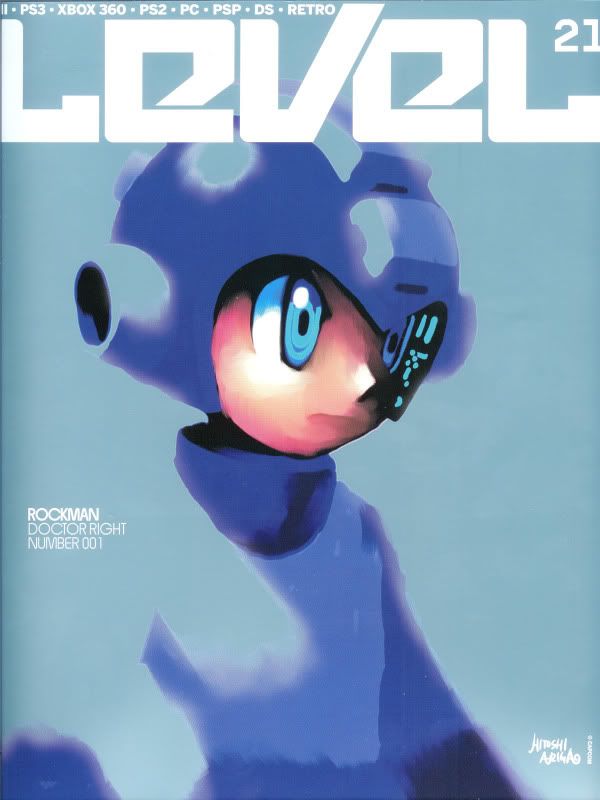
ItsInMyVeins said:I'm kinda surprised no one's used that cover from a magazine a year or so back. It's a painting of Mega Man (by Hitoshi Ariga) made for that magazine exclusively. I'm pretty sure someone made a wallpaper out of it and all.
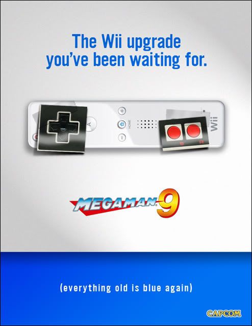
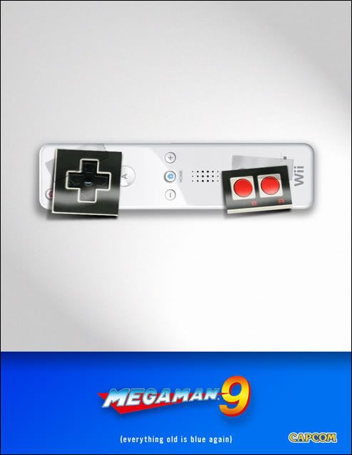
Looks good. My reaction is that maybe, for that extra minimalist approach, placing the Mega Man 9-logo down in the right corner, with the system logos to the left could look cool too.
ItsInMyVeins said:Looks good. My reaction is that maybe, for that extra minimalist approach, placing the Mega Man 9-logo down in the right corner, with the system logos to the left could look cool too.

That picture is truly amazing, but as far as i'm concerned i wouldn't use it to promote a game like Mega Man 9.Tenks said:That doesn't mean it doesn't look any less fucking beautiful.
I don't think anyone said it had to be a retro inspired ad I thought it was just a MM9 ad. Then again I'm not sure if I ever read the OP
Mdk7 said:?
I thought about this one at first, but it's too artistic for a retro style ad.
IMHO at least.
tahrikmili said:Yeah, looks much better. Removed the old one.
LRB1983 said:
I personally like it a lot better now, good work pal!TheGOHN said:Not sure if im happy with it but here you go.
http://i211.photobucket.com/albums/bb68/venom1384/mm9teaser2.jpg
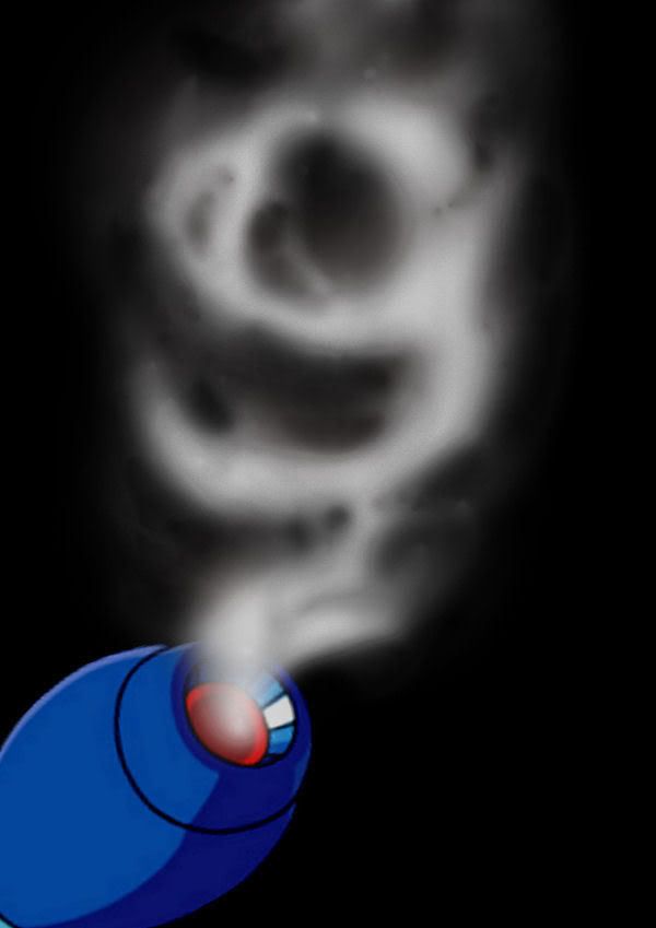
This is my favorite. So clever.Exypher said:
TheGOHN said:Not sure if im happy with it but here you go.
Mdk7 said:I personally like it a lot better now, good work pal!
May i suggest you another take on the same (cool) idea? Try to put the 8-bit cannon there instead of the drawn one...
Just to see how it looks, i think it could work...
Do it man!TheGOHN said:Im gald you like it and I think thats a great idea. If no one tries it Ill give it a go.
Unless I cant get it done before the deadline.
Mdk7 said:I thought about this one at first, but it's too artistic for a retro style ad.
IMHO at least.
As i said:AniHawk said:No one said it had to be retro style.
Android18a said:
Yeah. We're all mature adults here, so I'm assuming that most of us are above this, but...
I hope the swearing doesn't offend any Americans in the room.
Exypher said:Made some minor changes, but I think it looks better now.
Really glad you guys like it!
TheGOHN said:ItsInMyVeins: Can't wait to see what you come up with.

ItsInMyVeins said:Is it alright if I use the bottom of you pic for an idea I'm trying out? The part with the logos of Capcom, PSN, XBL and Wii Ware? I'm kinda rushing it here and I haven't got the best computer stuff to work with
mik said:One moar...
TheGOHN said:Not sure if im happy with it but here you go.
Ledsen said:I love it, but I really think it would work much better without the text at the top. It's kind of a GAF injoke and I think letting the picture speak for itself would make a bigger impact on me.

Sidzed2 said:2 days will keep things pacier and fresher, I think... but you're the maestro!
sevenchaos said:Make it two days.
xintin said:
MNC said:Hey. Hey. Hey. You know what would be nice?
A real awesome rar/zip with all of the entries at the end of each round
Exypher said:
painey said:great start of what should be a long running series of challenges. The Wii upgrade one is my fav, is there going to be a Fark-style vote for a winning entry?
xintin said: