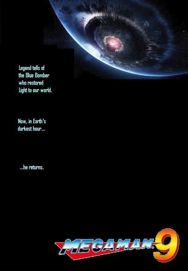
itsinmyveins
Gets to pilot the crappy patrol labors
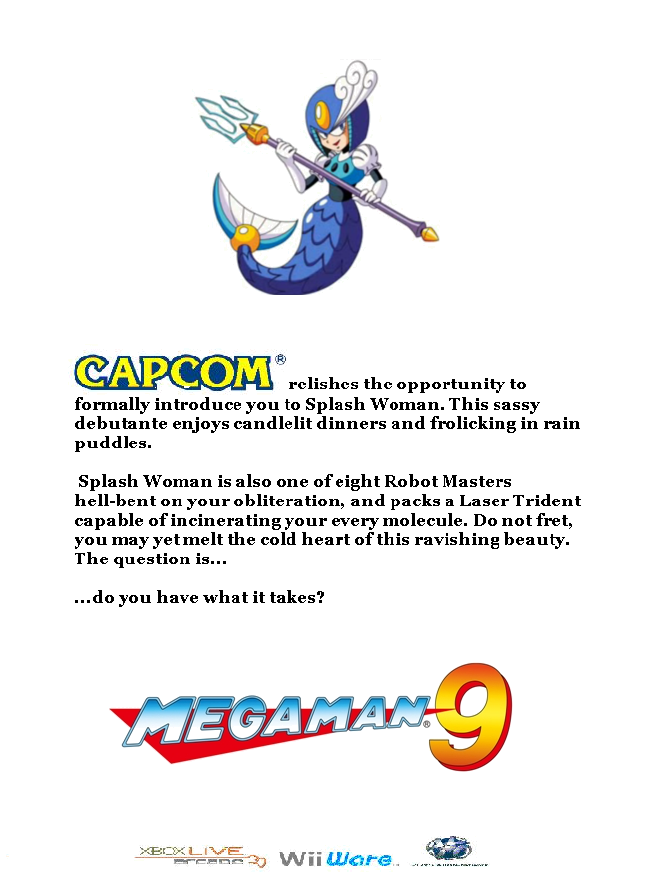
DigitalA1chemy said:Thank you, kind sir. I thought for sure I would get some comments for even using the old-school Capcom logo, but nothing.
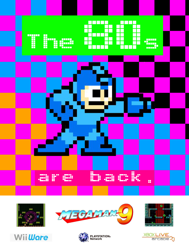
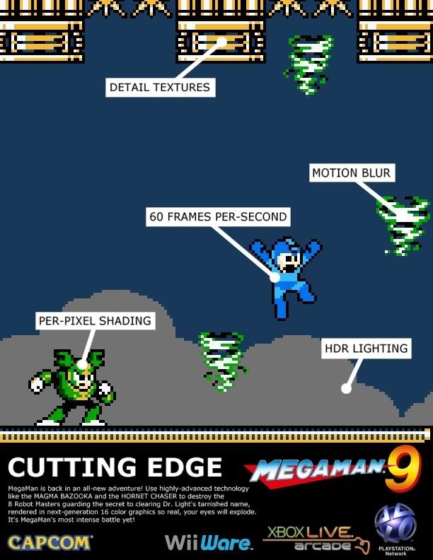
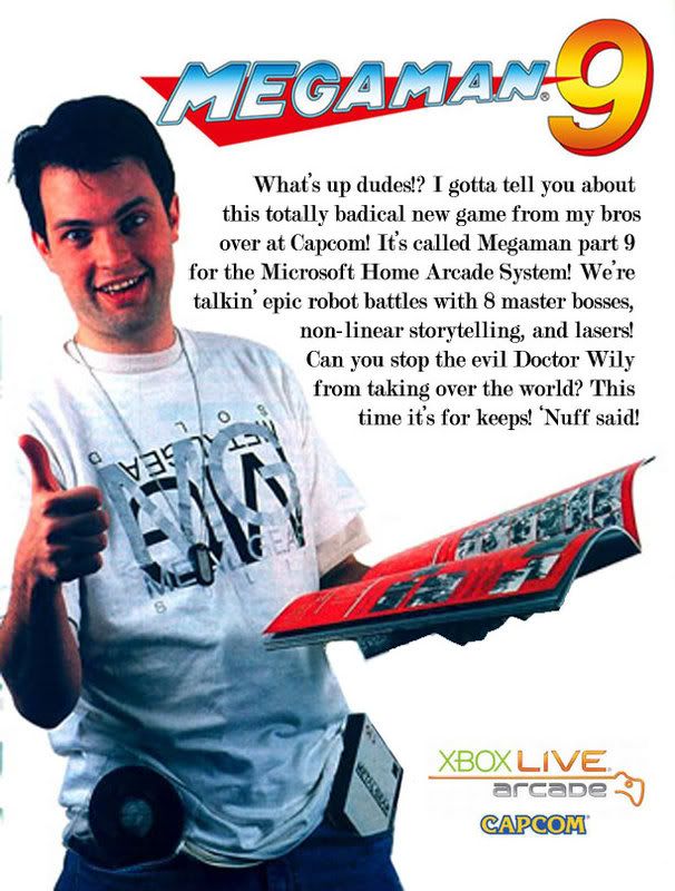
I kinda assumed it was, even if I wasn't sure. But showing the game package with a big fat font, rounded screenshots and that Times New Romanesque font are all nice details. I don't know if was an accident, but seeing that the bottom of the two text blocks don't line up adds to the whole "back in the day when no one knew shit about ads"-vibe :lol
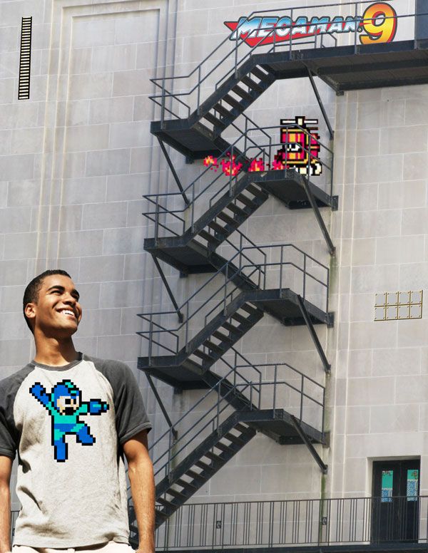
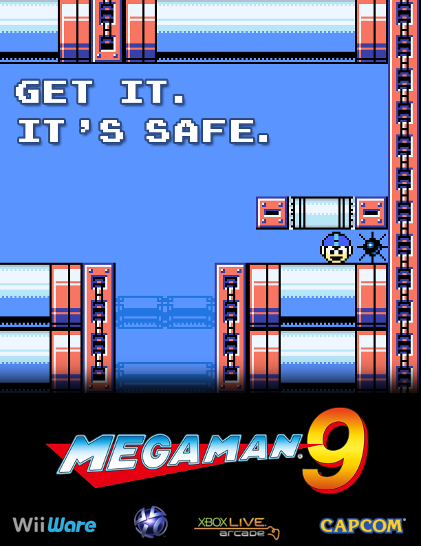
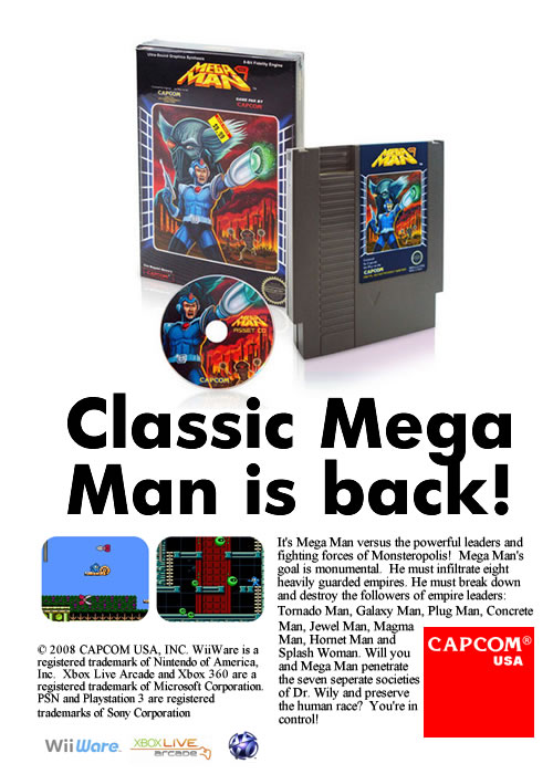
I do think robotnjik deserves som praise for his second ad too, which is the one that looks most professional and current. It doesn't do anything new or interesting, but it's most certainely a solid one.


")