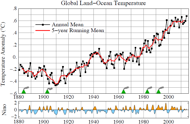
1) Notice the chart stops at the year 2000, it doesn't show the decrease in temperature change with increased CO2 after 2000
2) Notice the temperature is increasing from 1910 to 1940 at a greater rate than after 1950 to 2000 when our CO2 consumption drastically increases and as you move to the right the amount of CO2 in the atmosphere increases. This chart shows that as CO2 increases the effect decreases.
3) from 1940 to 1975 the temperature decreases and this is the industrial boom after and during WWII where CO2 going into the atmosphere drastically increases.
The slope of the temperature line tells all. The following is a better chart showing the slope doesn't change which means CO2 is not having an impact in global warming. The first and second slopes are before Man made CO2 could have an impact on global temperature. Something else is causing that warming and the rate is the same as attributed to man made CO2 in the third red sloping line. .
Read the chart, before man made CO2 the temperature increased .9 degrees from 1910 to 1940 and .7 degrees from 1940 to 2000. Do the math and there is less global warming after man made CO2; in 30 years .9 degree vs 60 years and .7 degrees.
Chill guy, it's natural processes not man made. A longer chart shows the medieval warming period was withing the margin of error the same as today. That's what the chart on the top shows. The bottom chart was fudged and leaves out the medieval warming period and squashed the chart so that you can't see the slope is the same as before man made global warming could have had an impact.


")