internetwolf
Banned
Fuck no.
Fat Pikachu FTW.
YUCK
Fuck no.
Fat Pikachu FTW.
Dante from Devil May Cry to DmC.
Went from alright to my favorite character design in all of gaming. What a badass


The best design for Link to this day.


80s Link is the best Link. I'd kill for a cell shaded Zelda game in this style.


Yeah, I thought it was a great redesign when Marvel came out, but apparently he always looked like that in the manga that debuted alongside the first game.
Both are awesome. Rising redesign tho so good
What's the difference?Sly Cooper.
No way. I'm tired of slim Pikachu and how it gets crammed into literally every single piece of Pokemon advertising along with that squeaky voice.
Must be a classic case of Westerners don't like scarves...?
No.... Redesigned Palutena is the best Palutena.I like the NES version better.
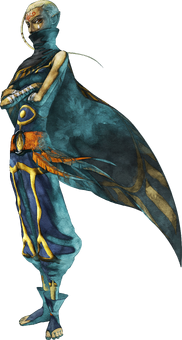
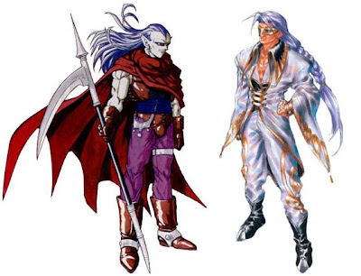
Alucard from Castlevania III (NES)

Alucard from Castlevania: Symphony of the Night (PS1/Saturn)


hehBecause fat pikachu was some kind of baritone, right?

Monkey Island has been going up and down for awhile but I think The Curse Guybrush was a great redesign


Dante from Devil May Cry to DmC.
Went from alright to my favorite character design in all of gaming. What a badass
First post should be ashamed of himself.
Ot
don't kill me
I'm absolutely serious! I love New DanteNot sure if serious...
")
Horrible tone? I don't think I was being rude.I knew this post was coming, but why did it have to be the first post? Sets a horrible tone for the rest of the thread.
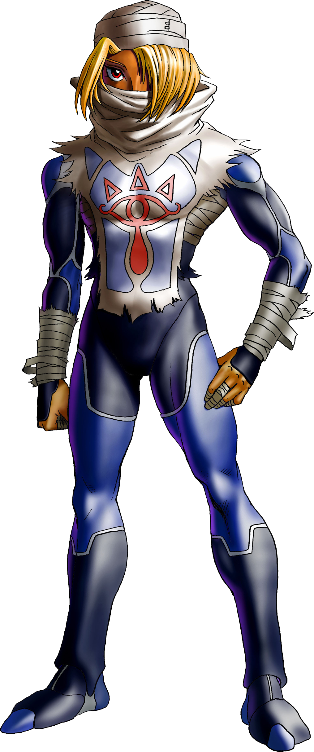
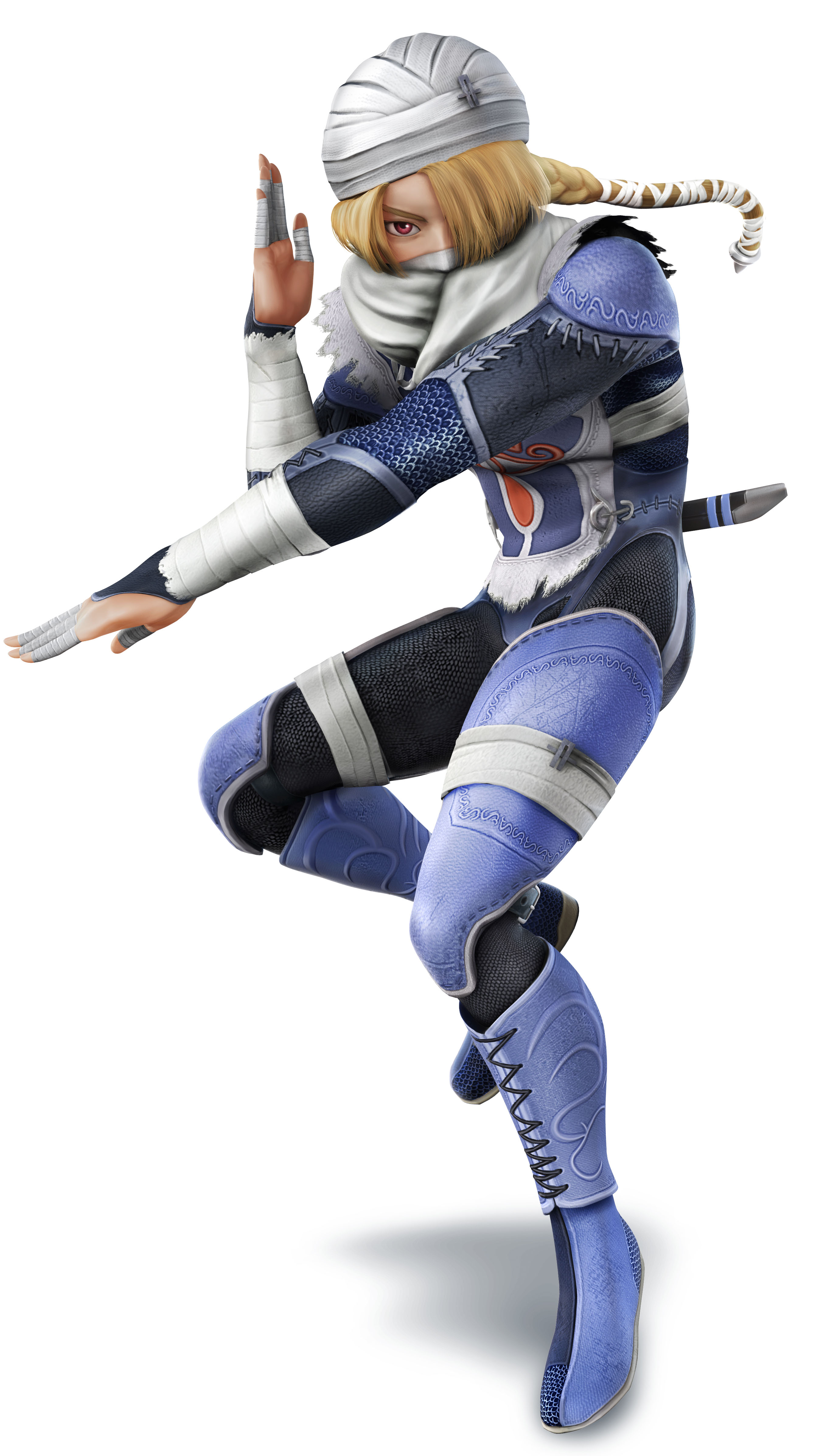
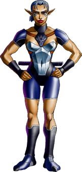
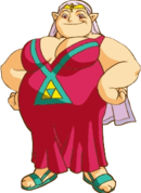
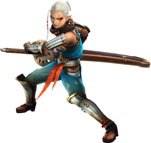
Impa, from the Legend of Zelda games
Went from old granny
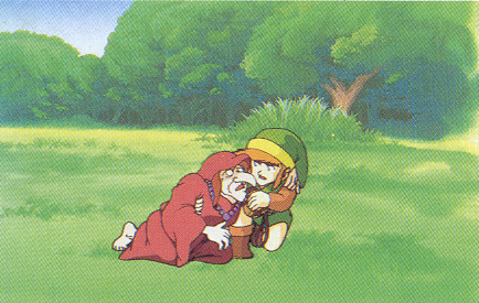
to someone that could pass as a Platinum character
Palom & Porom

First post should be ashamed of himself.
Ot
don't kill me
Horrible tone? I don't think I was being rude.
Great.
Fantastic.


Dante from Devil May Cry to DmC.
Went from alright to my favorite character design in all of gaming. What a badass


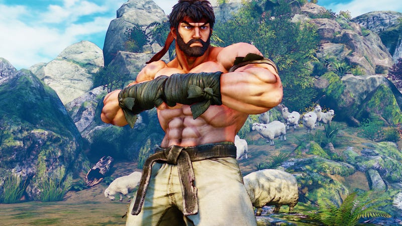
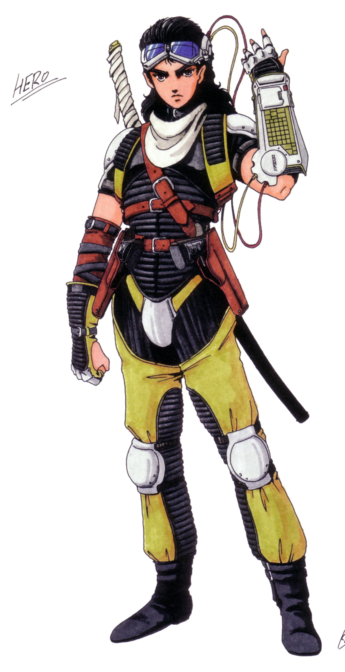
Hipster Ryu
I don't think you have played very much Devil May Cry.new Dante's design is actually pretty sweet, they changed it enough from the old emo shit
I don't think you have played very much Devil May Cry.


Jolly Roger as a classy hobo.
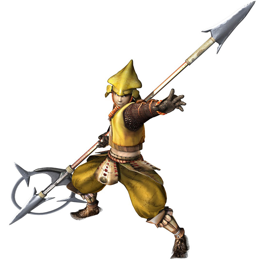
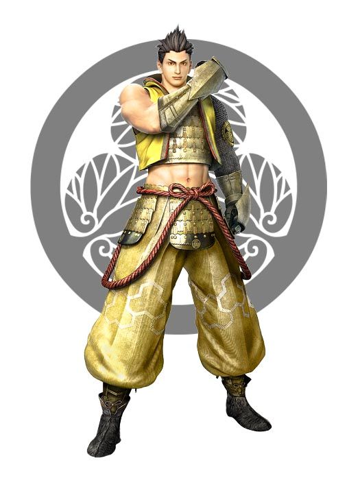
Ieyasu goes from a wimpy commander who relied a lot on Hondam to one of the most badass characters in the sengoku basara series.
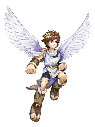
Pit from Kid Icarus.
.png)
[Impas]